Power UI
Overview
For my bachelor thesis, I wanted to apply my knowledge from studying with something I am passionate about. So I chose to make the UI for a fictional video game! To take something managable, I created a mock-up for a fictional building-simulation game on mobile. Because a video game UI is highly interlocked with the gameplay, I also tried coming up with a simple gameplay loop.
In the following, the User-Centered Design Process was used to create the product. The steps were as follows: Analysis, Concept, Design, Implementation, Evaluation.
Table of Contents
Concept
Because I wanted to make a UI for a fictional video game, I had to come up with a fitting video game genre. The genre itself has a huge impact on how the interface is designed. Generally speaking, more casual games (like Match 3 or Idling) require less UI. So I chose building-simulation
as a challenge. Typical building-simulation games are the Anno series or SimCity.
The design followed the Mobile-first principle. It was more important to get the game UI working on a smaller screen, so it can then later be fitted onto bigger displays.
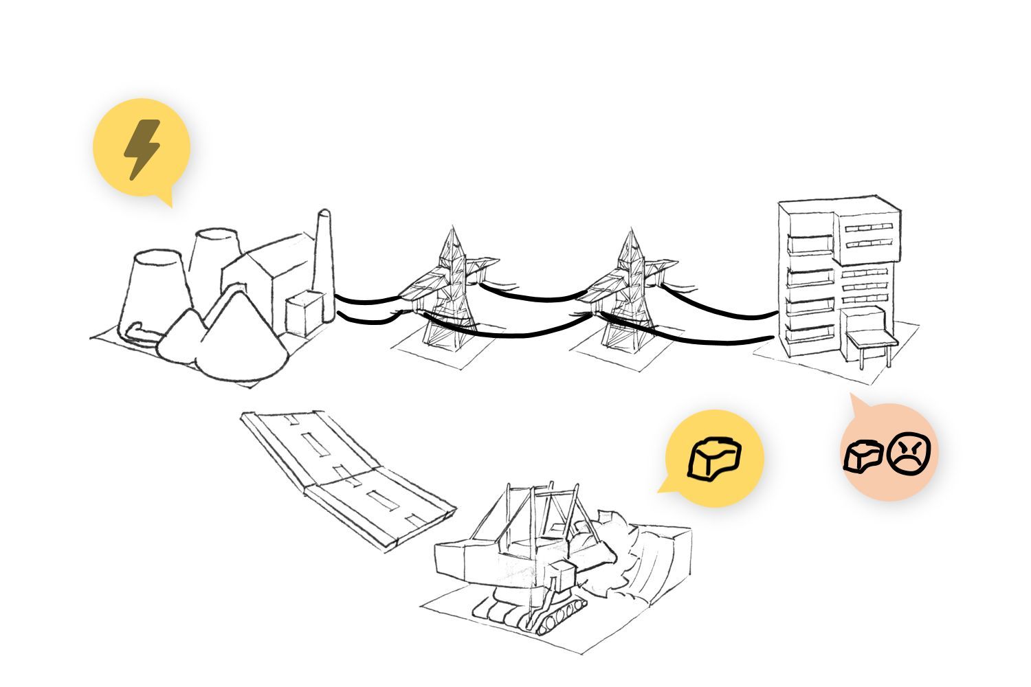
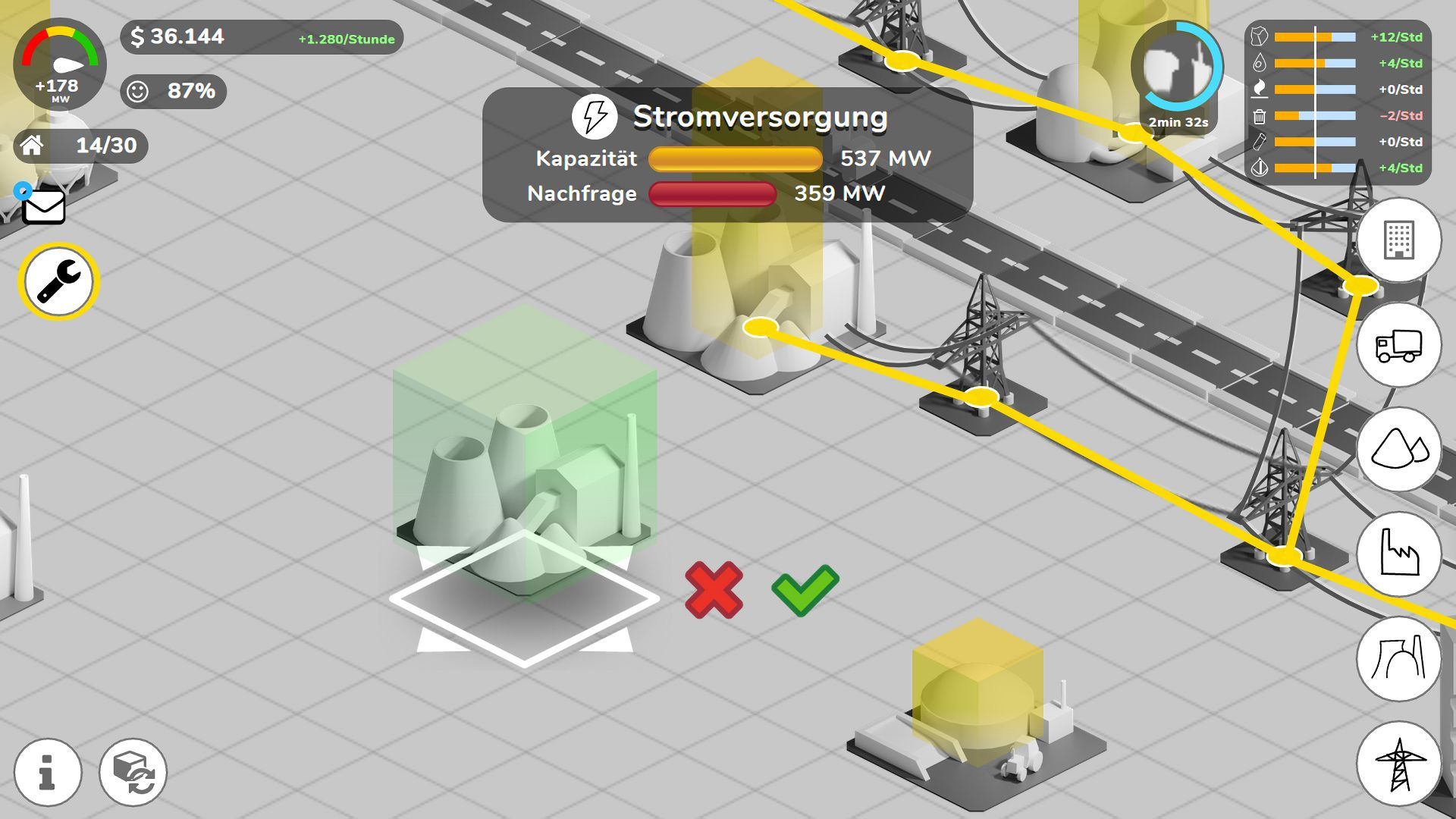
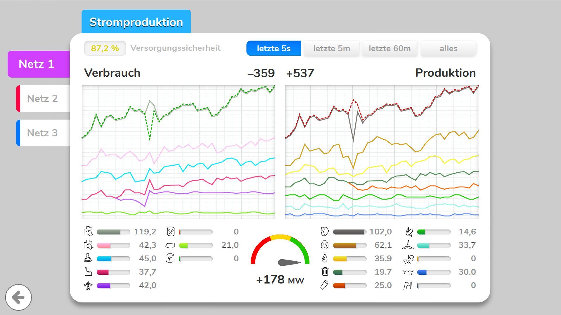
Next I had to decide on a theme. I looked for a theme, that covers one aspect of city building-simulation games: power supply. It is one of the most important infrastructure systems in our lives. Especially in Germany, there have been discussions about Energy Transition for decades. Because natural resources (like coal and oil) are running low, people are investing more into renewable energies.
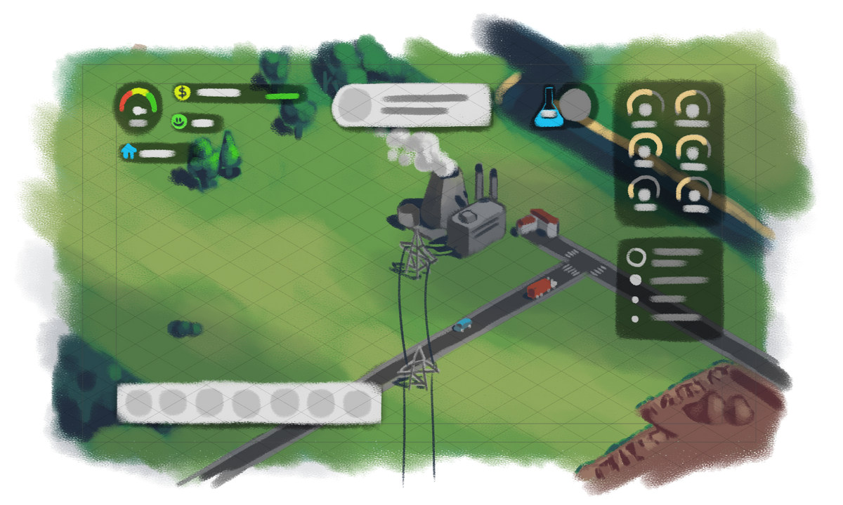
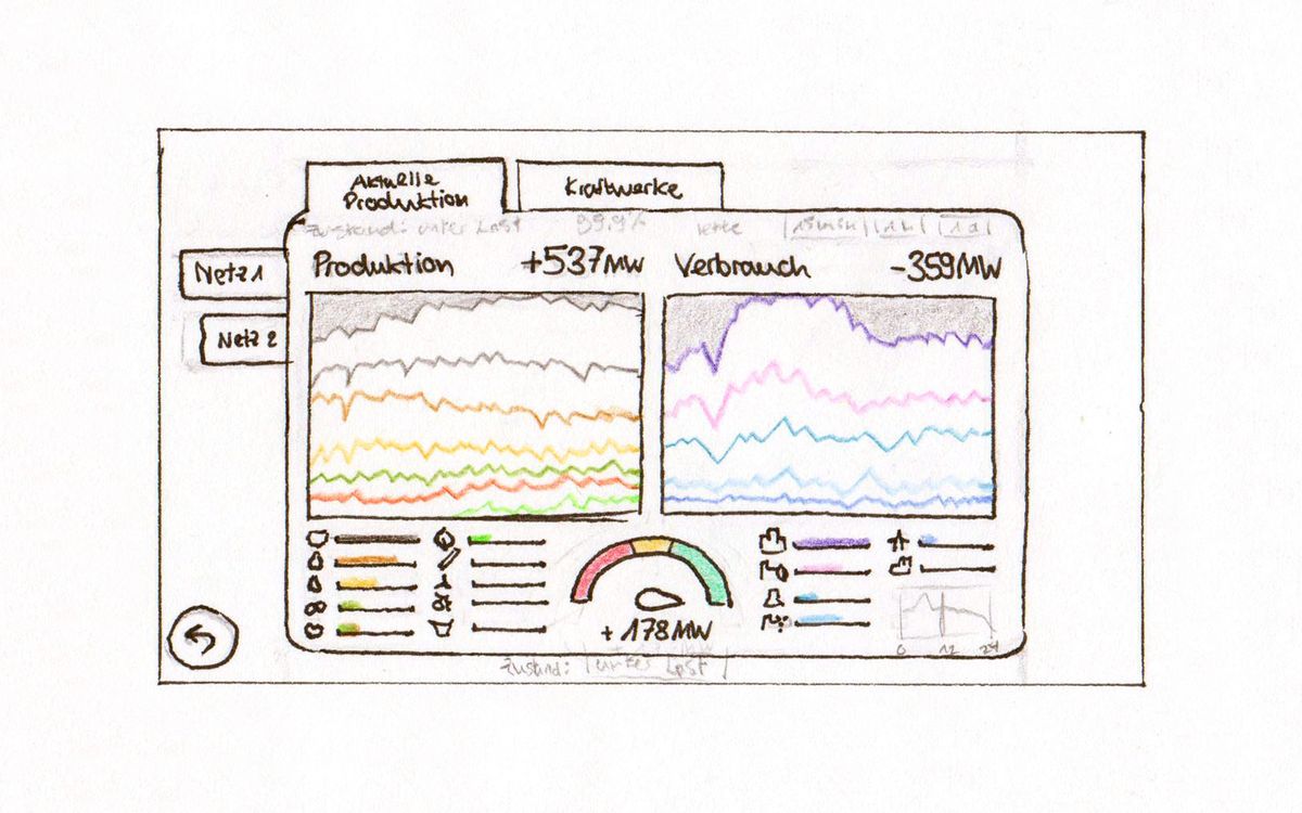
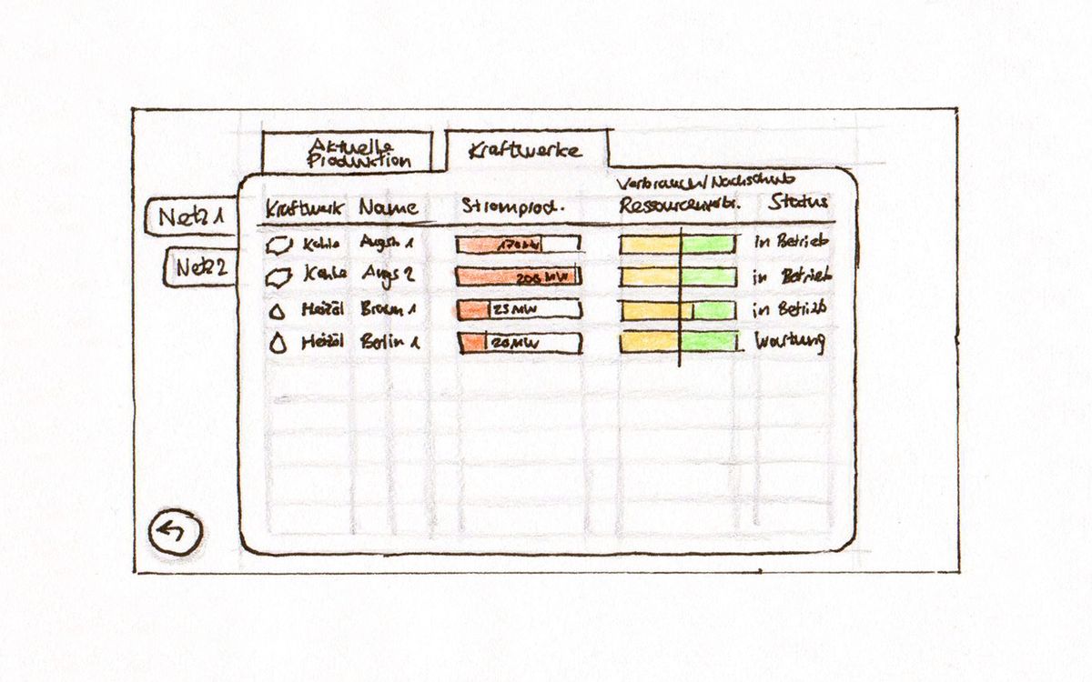
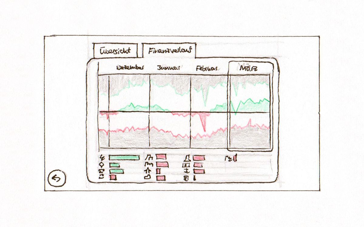
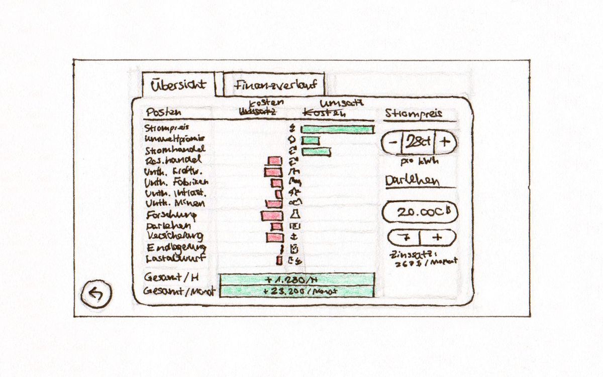
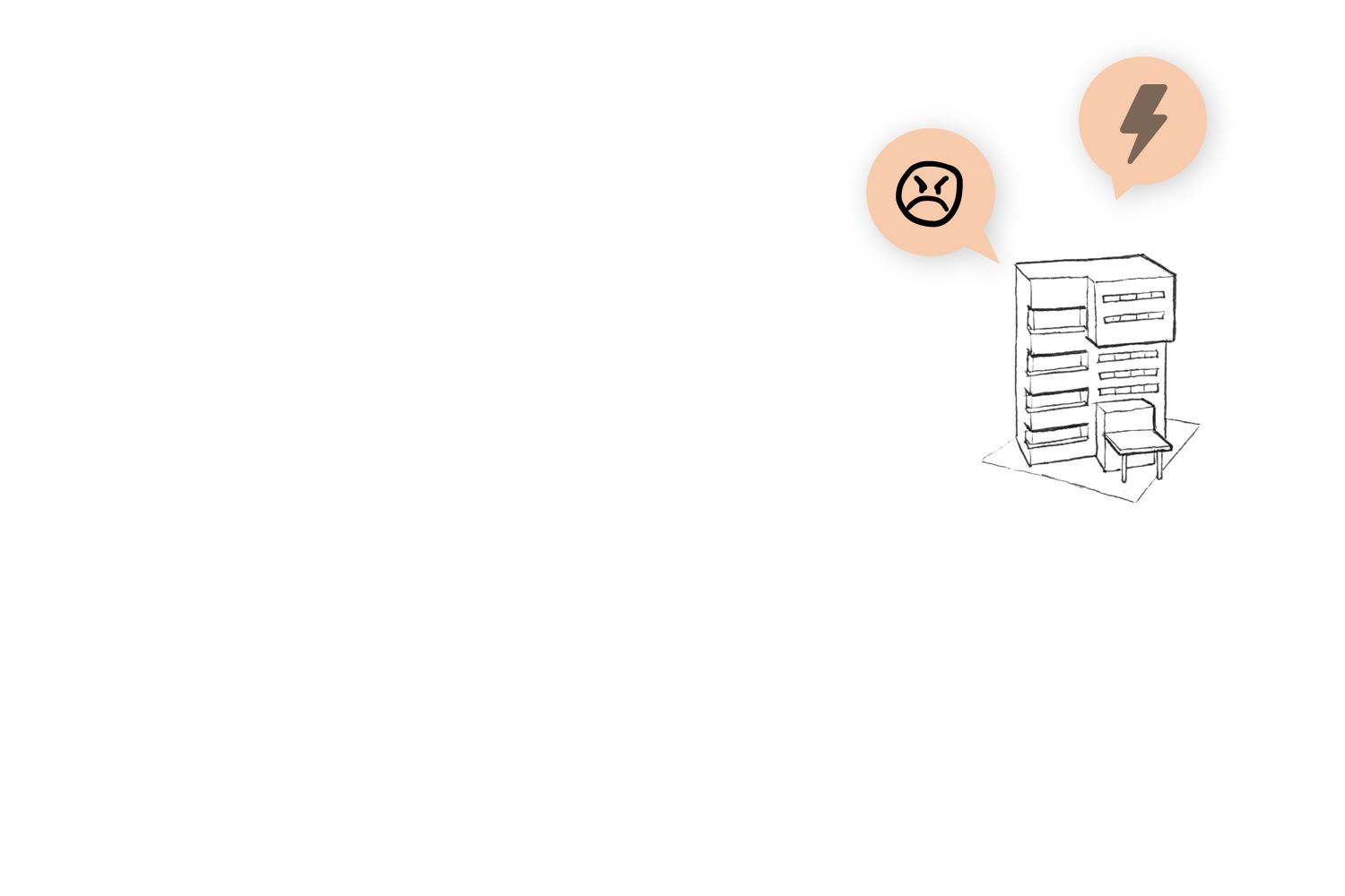
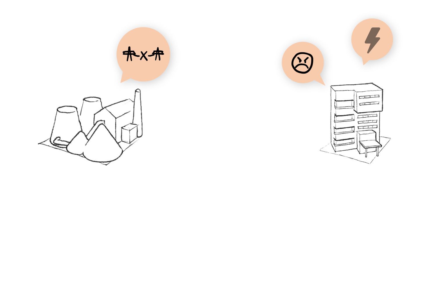
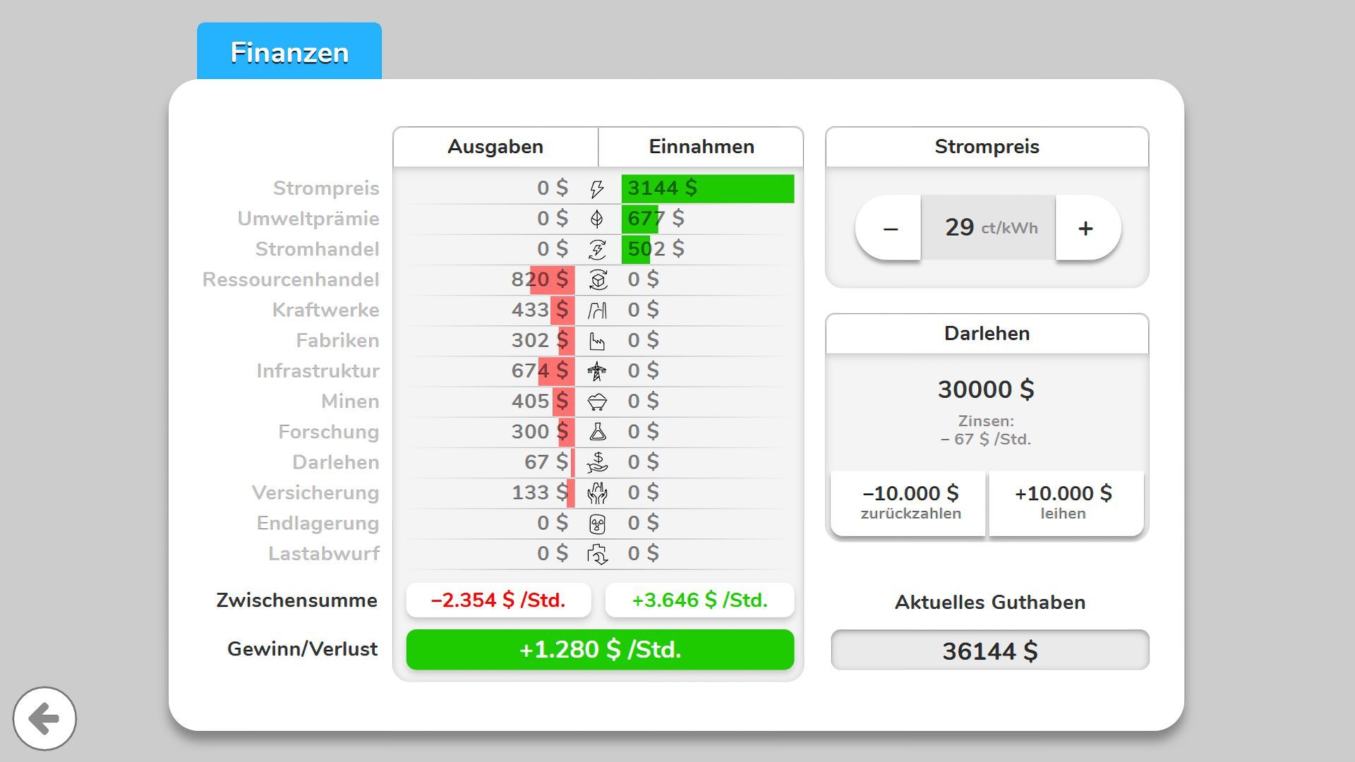
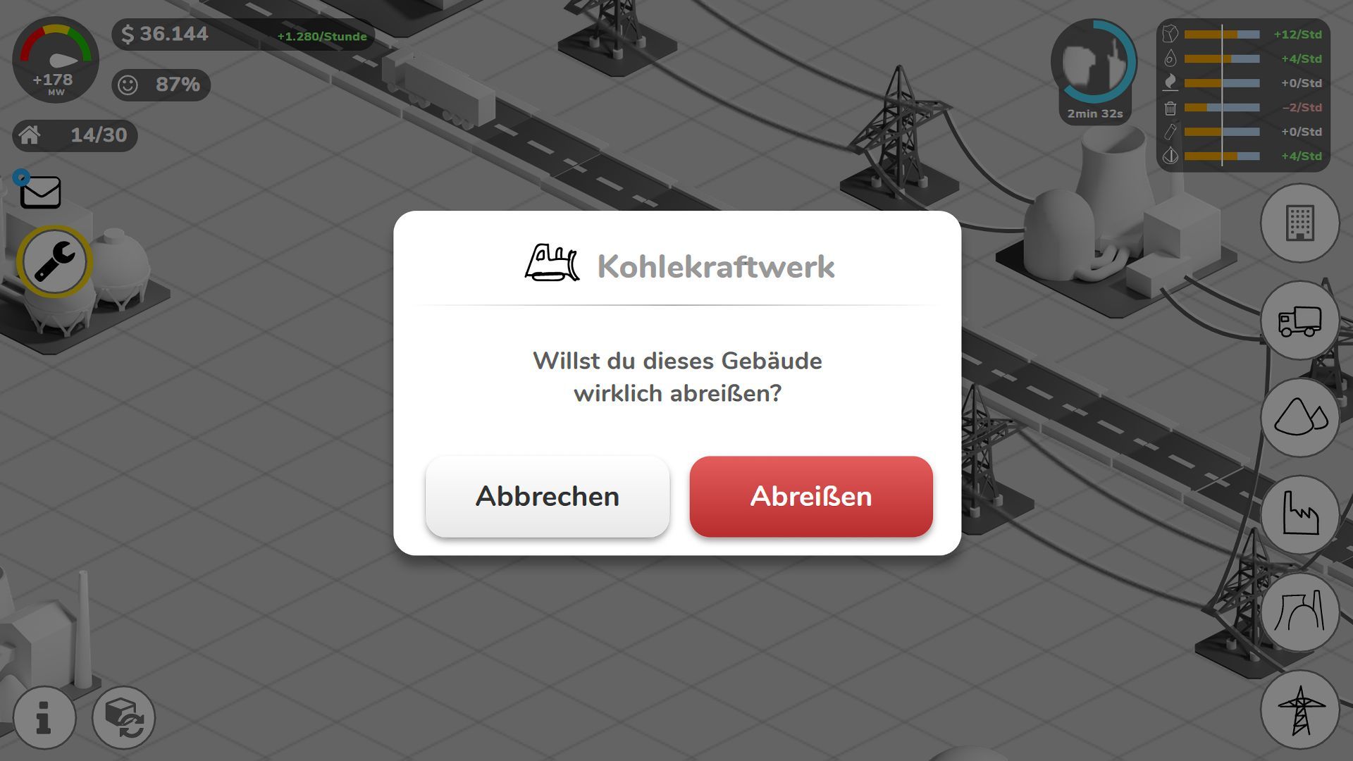
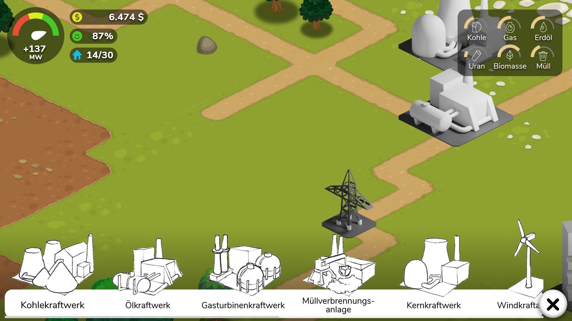
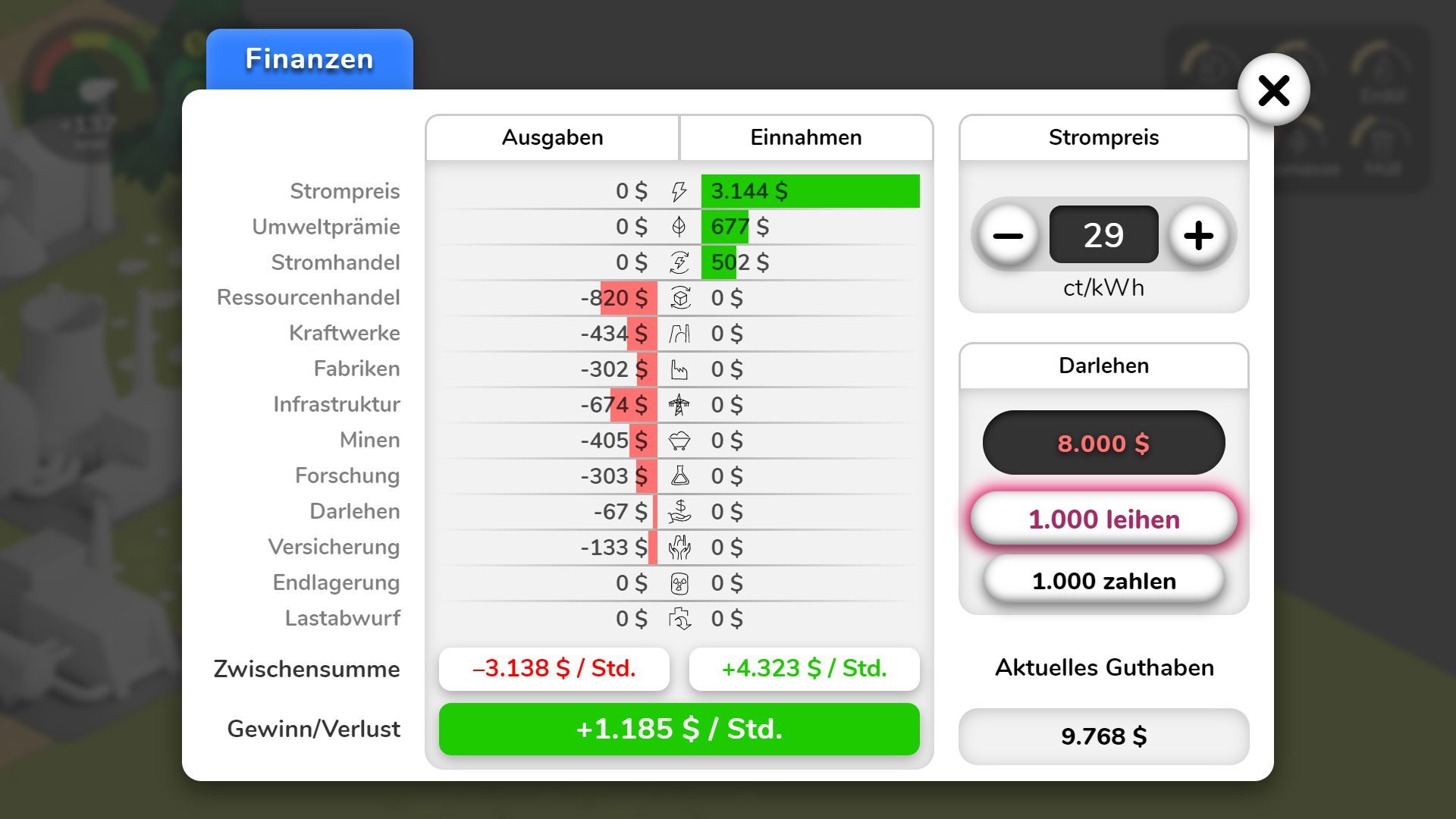
The game itself should touch on the three different aspects of Energy Policy: Environment protection, profitability and security of power supply. While playing, the player should find a balance between the different systems (like funds, resources, pollution, etc). And to inform those decisions, a complex UI is needed.
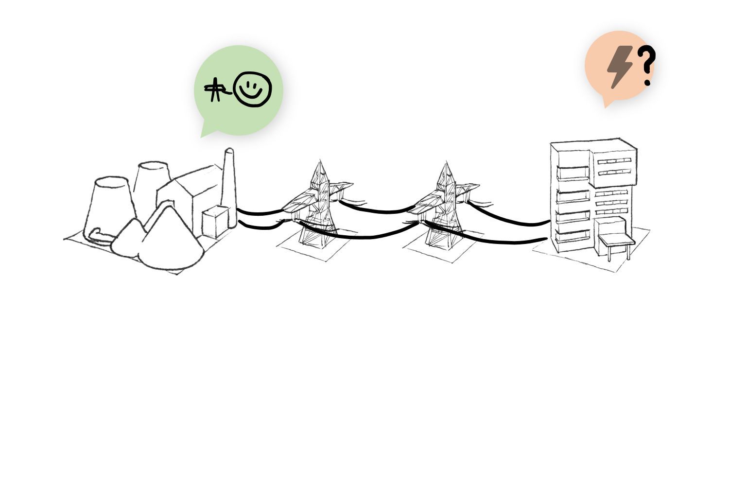
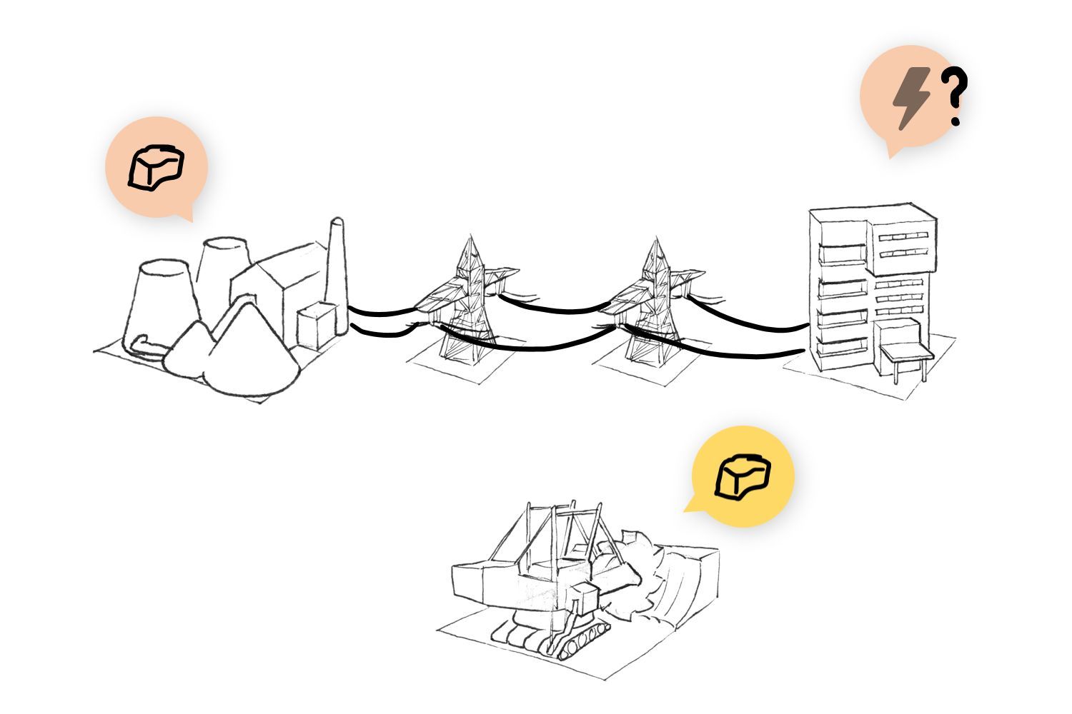
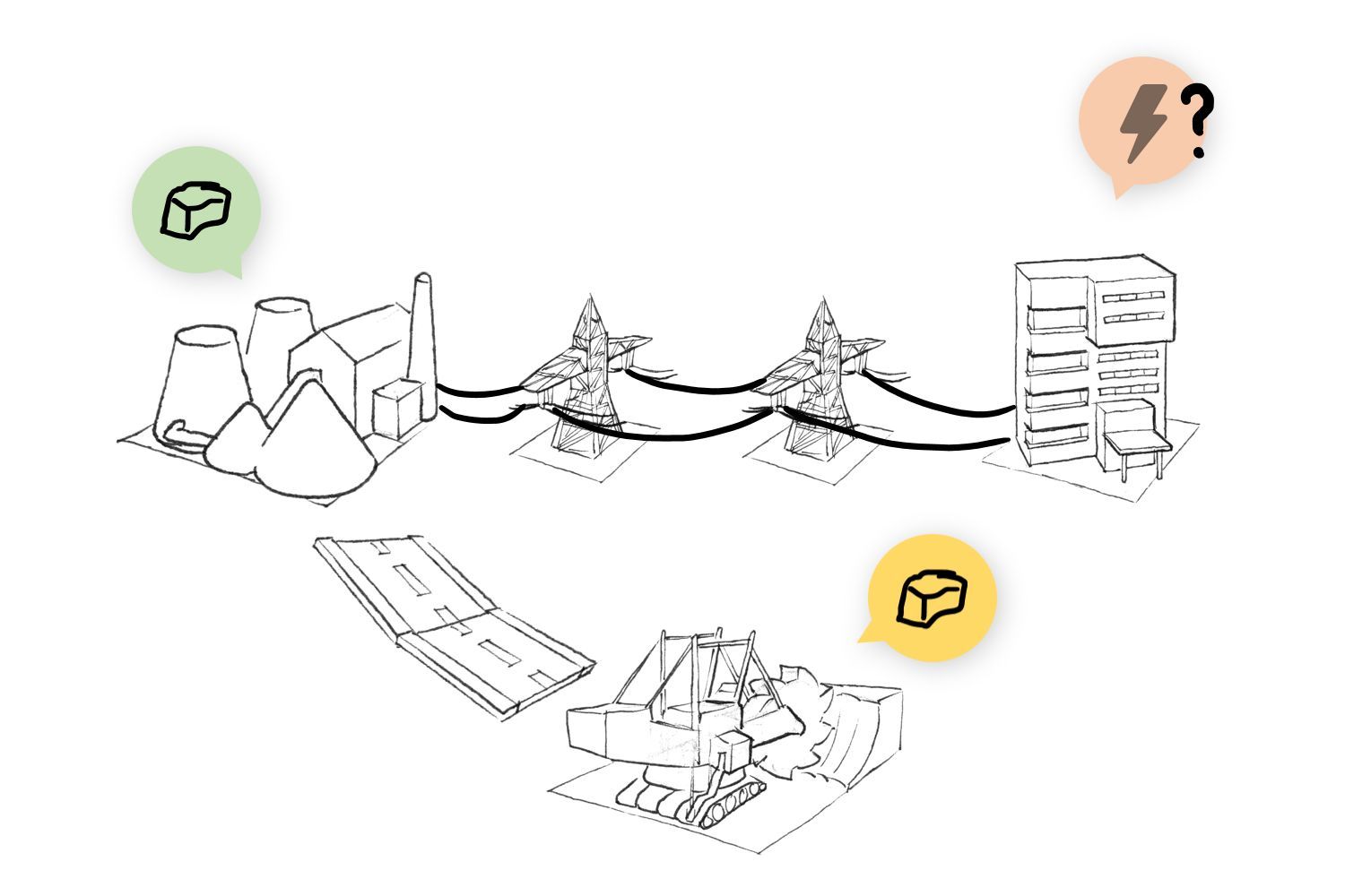
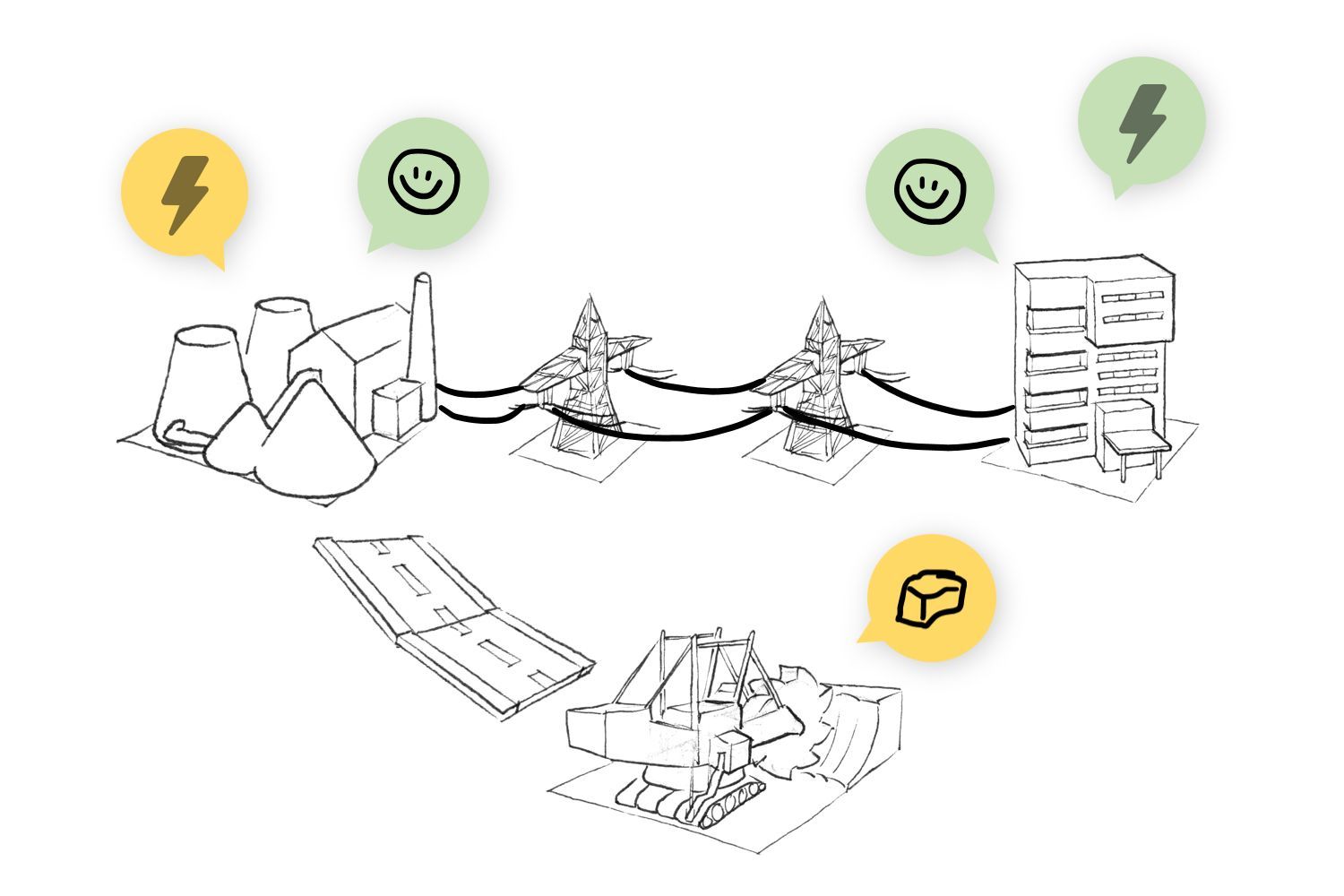
In the following, the core gameplay loop is explained with a short tutorial:
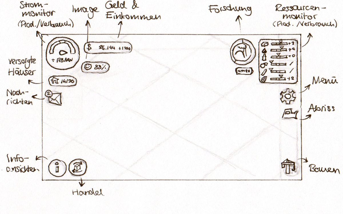
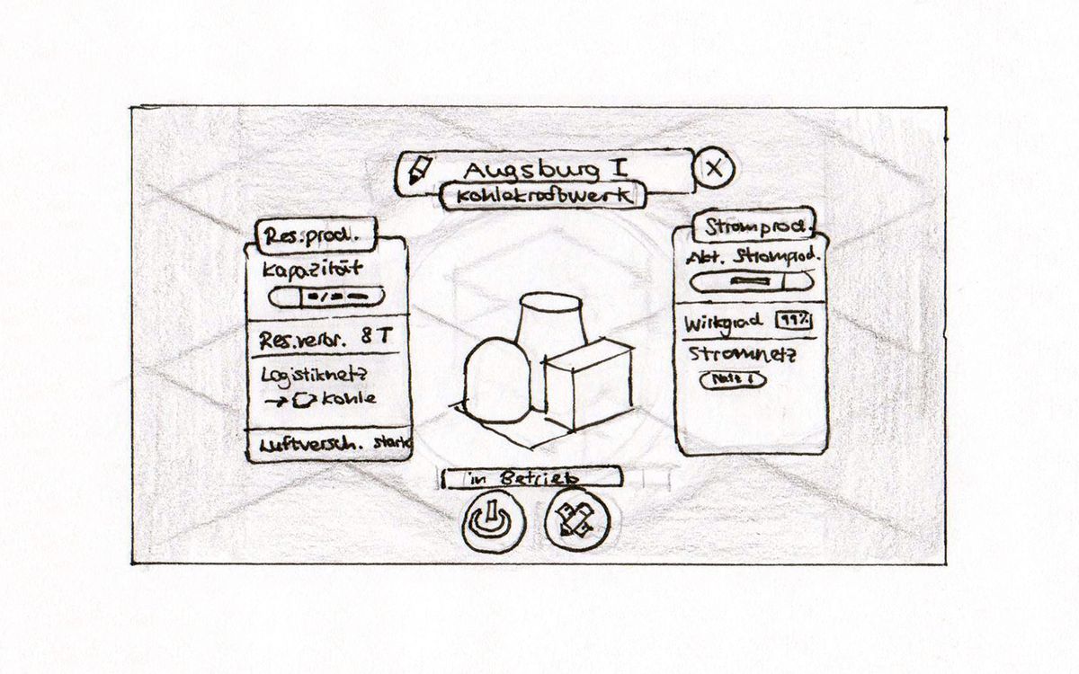
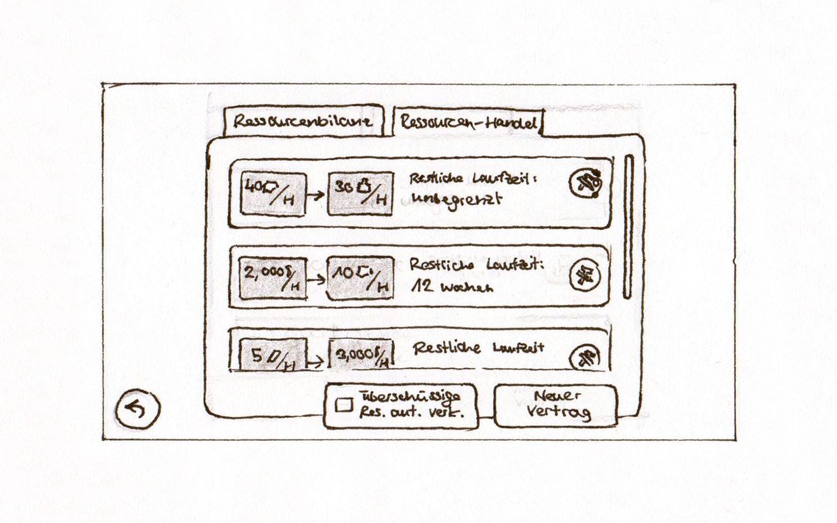
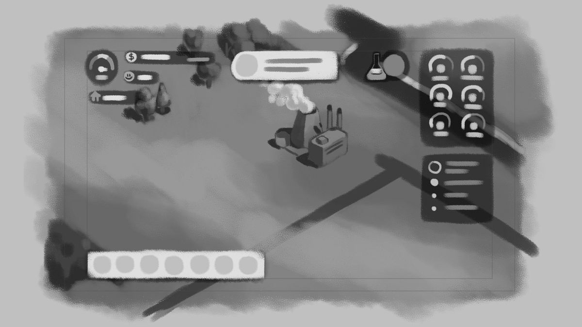
The next step then was to come up with the design of the interface. A requirement for the game UI was to be space efficient (on mobile). Screen real estate is limited, and the user should only be provided with as much info as needed. So the default UI is very space conservative, while info windows like finances are more generous.
Design
After the gameplay loop, the visual look of a game is the most important aspect. I tried looking for usable assets on sites like OpenGameArt or Humble Bundle. But it was obvious, that I needed to create my own assets. Screen design, icons, and game objects all had to be created from scratch, while a (modified) terrain from a Humble Bundle was used.
Icon Design
A lot of information had to be conveyed in a limited space. For this reason, a rich icon set was necessary. The first step was to quickly create many variations of icons that are needed.
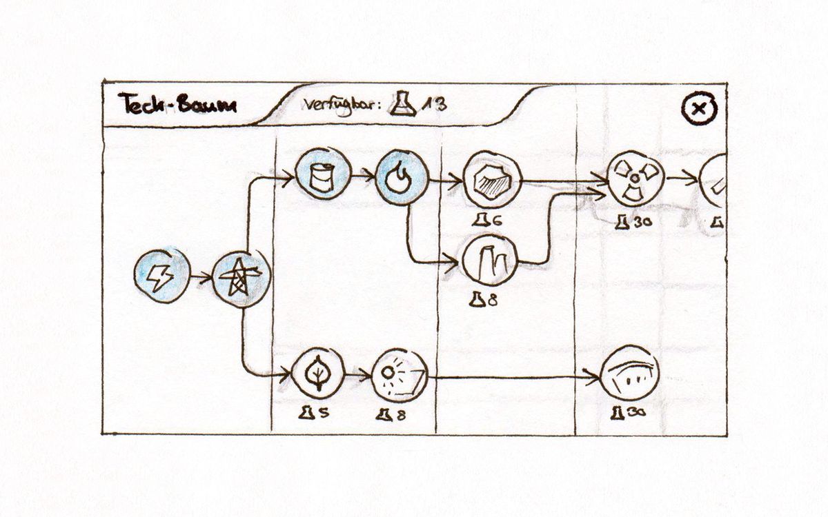
In the following, the first version of the icons can be seen. They were also used for the first prototype. The icons themselves range from building types, to resources and generic menu labels and symbols.
The second iteration of the icons was a refinement of the first one. The icons should appear round, friendly and well to distinguish. Overall, the most important icons were redesigned &endash; that means the ones for the build menu or UI state indicators like happiness.
Screen Design
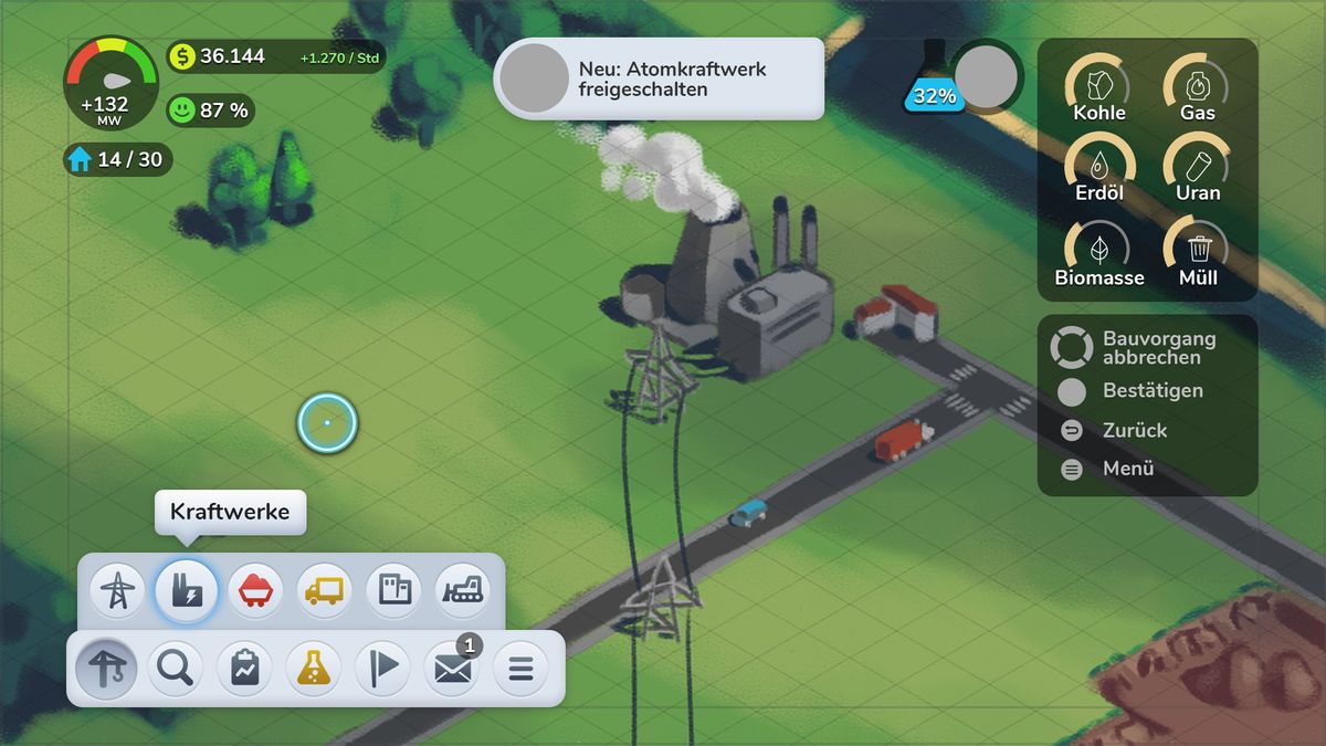
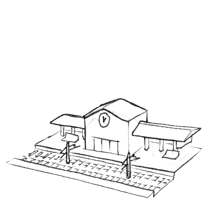
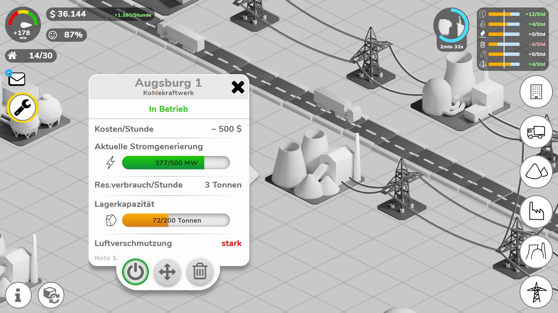
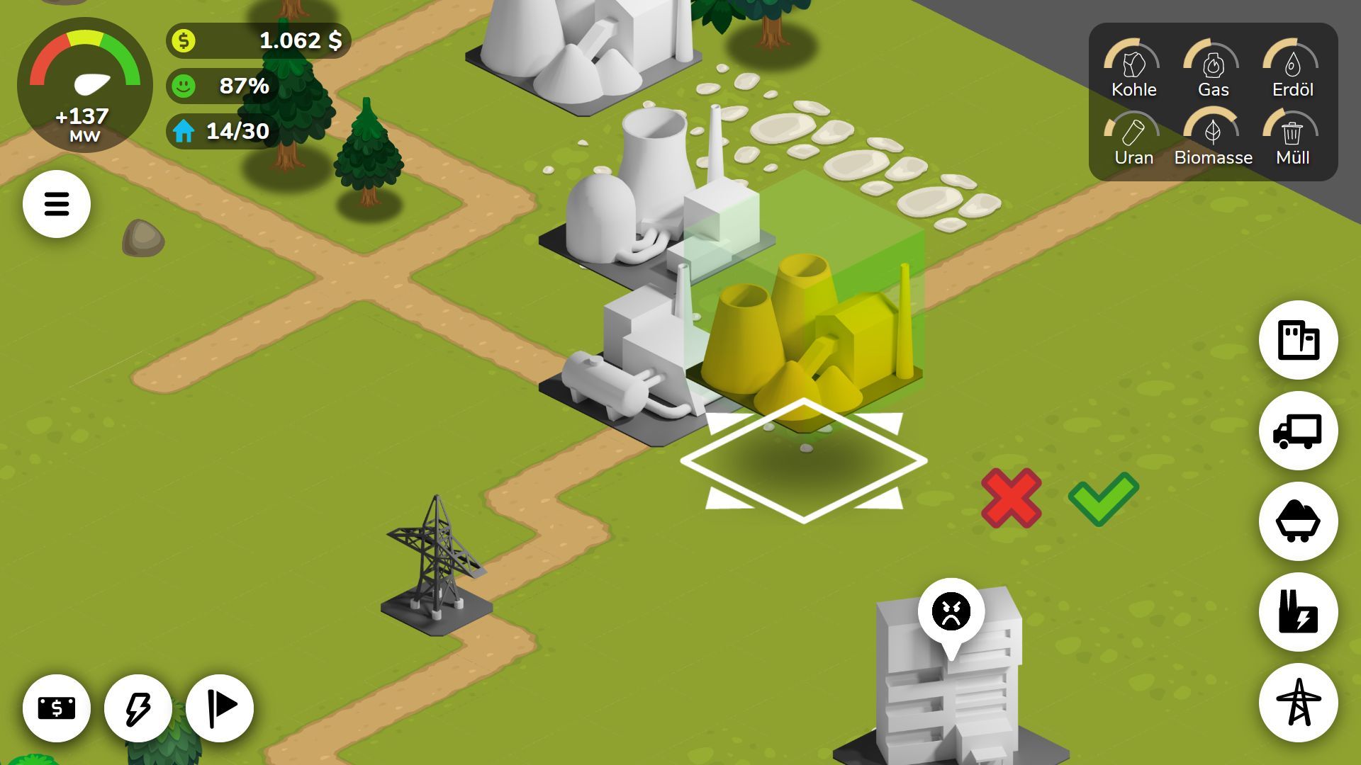
When doing the screen design, the two layers of game world and game UI came together. Based on the previous wireframes, the screen design was created. The UI elements itself only use little color for styling purposes, because color usage is for info reserved.
Before actually using colors in the screen design, I made sure that the overall look has good values. The UI-Elements should have enough contrast to the game world, so info doesn't get convoluted.
In the following, you can see how the Smart TV view looked like. It is very similar to a mobile view, but the navigation in the UI has to be aligned to the two input axis of the Smart TV remote.
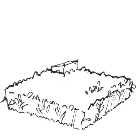
Terrain
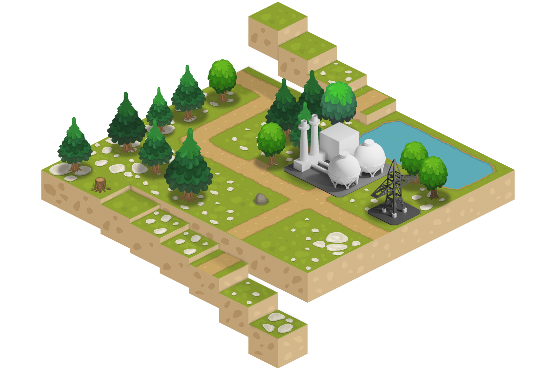
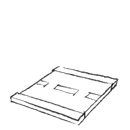
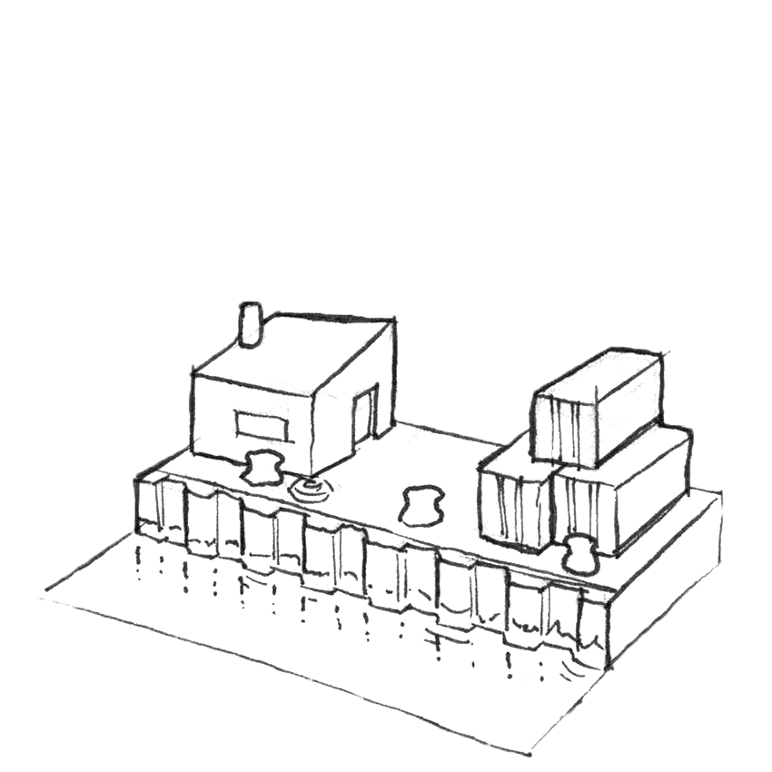
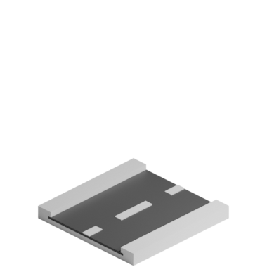
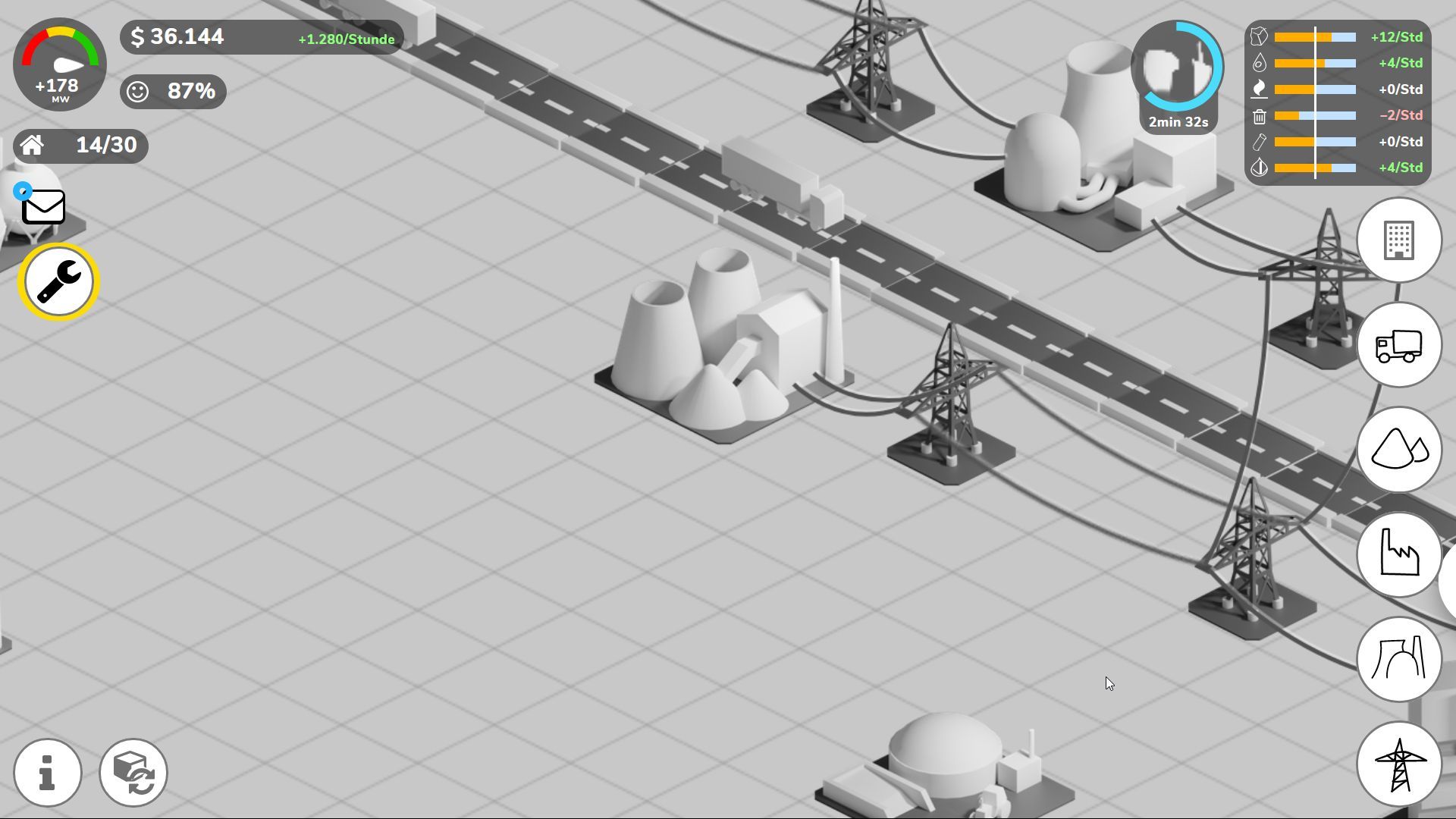
A game also needs a world in which it takes place. The terrain should have a simple, friendly and colorful style so it works together with the assets. I used a modified tileset as basis. The world itself is made up of individual tiles (or blocks). On top, there are doodads like trees, bushes or rocks. Also game objects like the power plants itself are placed into the world.
I used the Tiled Map Editor to create the map itself. Terrain and doodads were arranged in a tileset. The map then could be exported as json and reconstructed inside of the game.
Assets
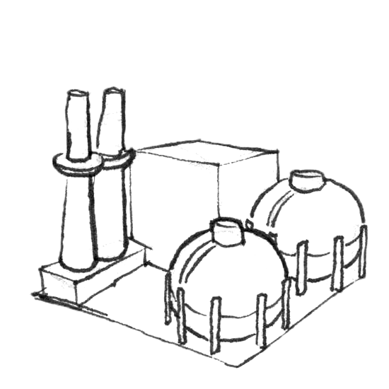
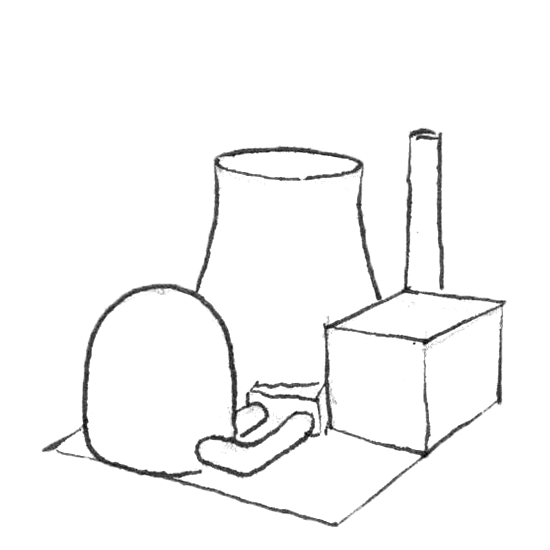
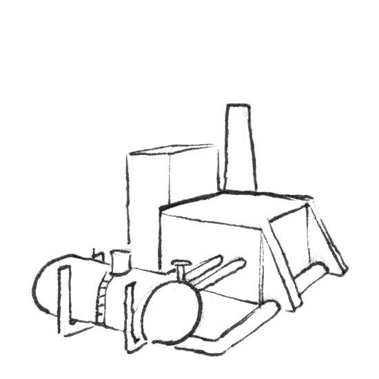
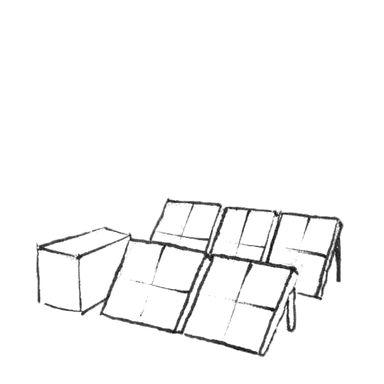
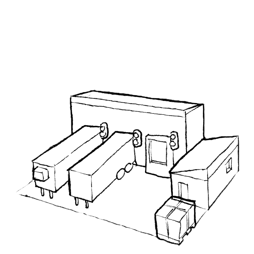
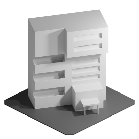
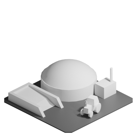
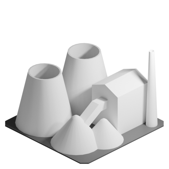
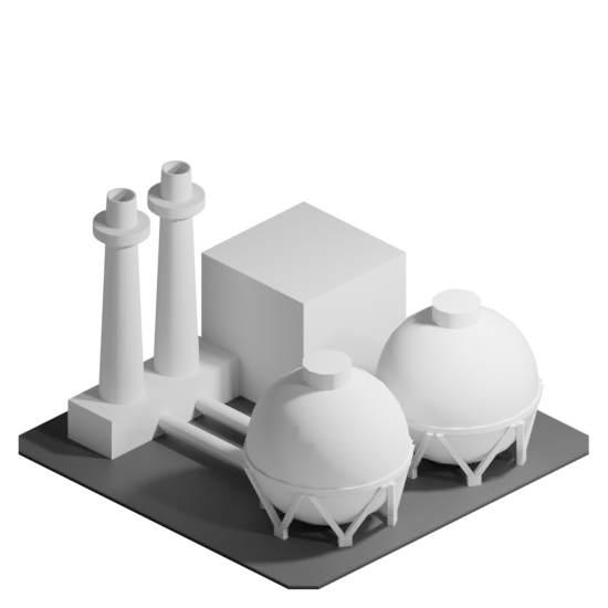
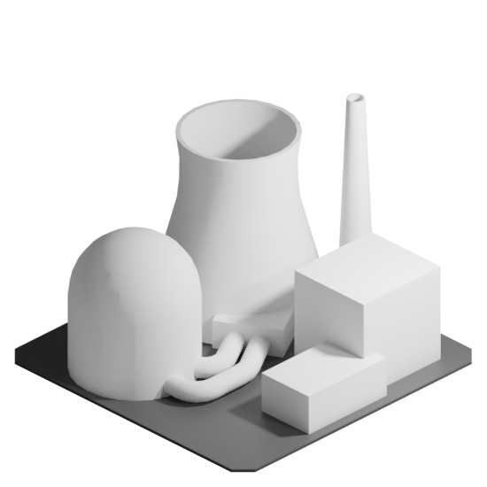
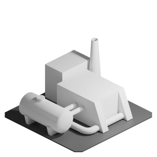
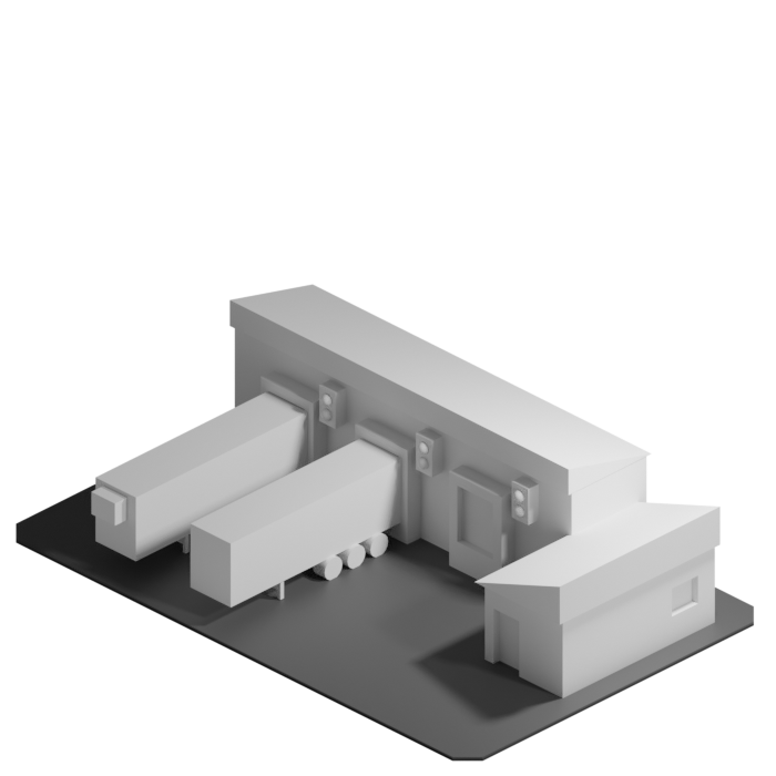
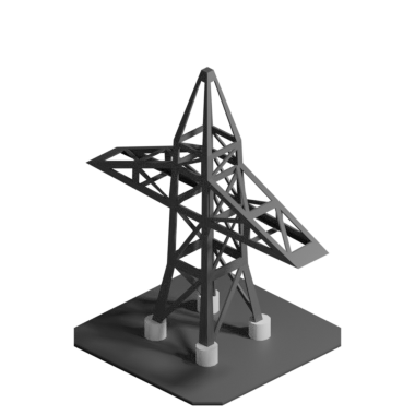
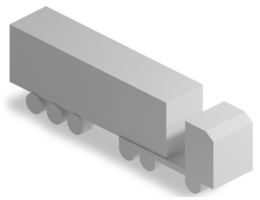
The assets for a building game a very important, because the player should see their progress in terms of big cities or complicated setups. To provide the player with plenty of options, many building assets were created.
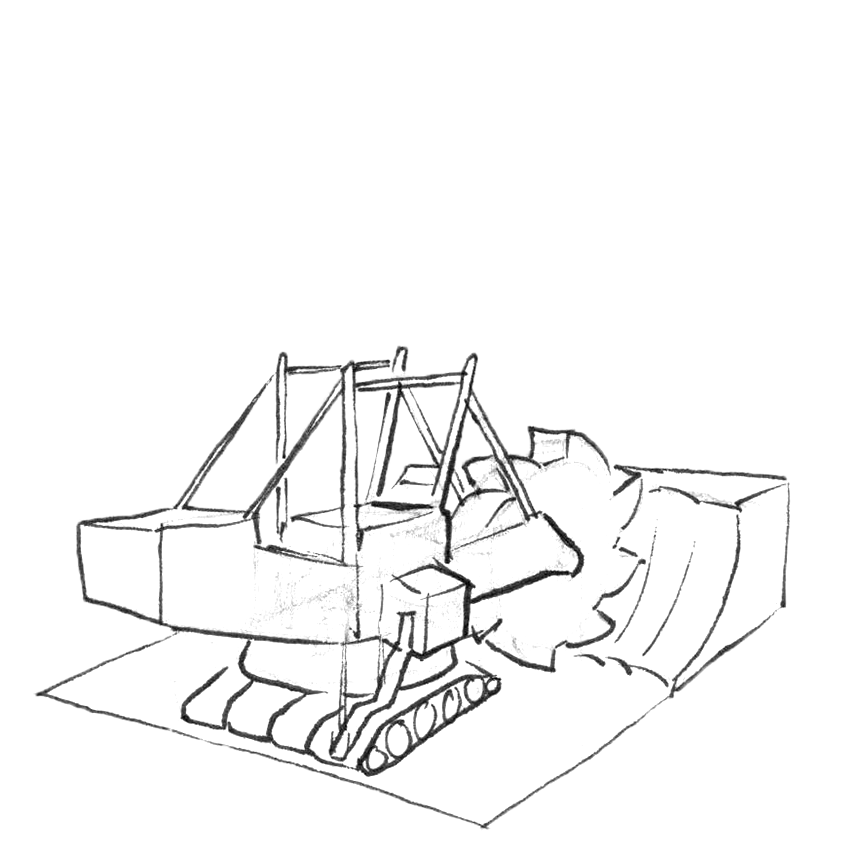
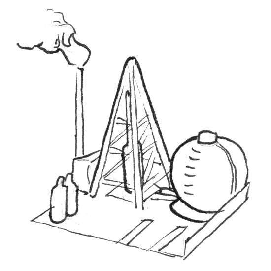
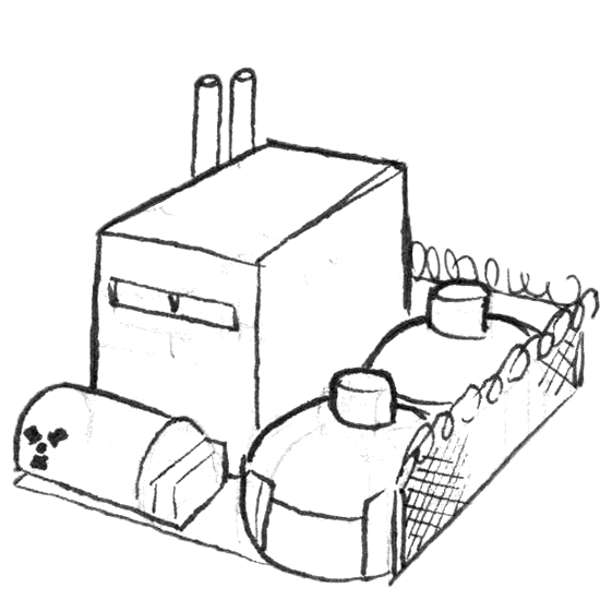
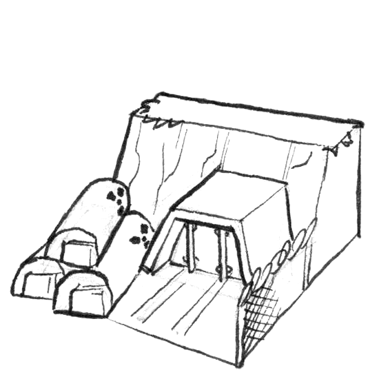
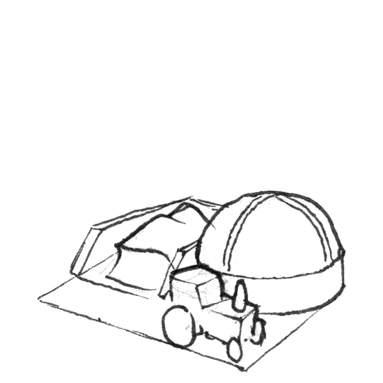
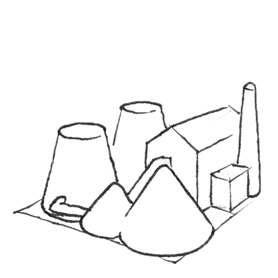
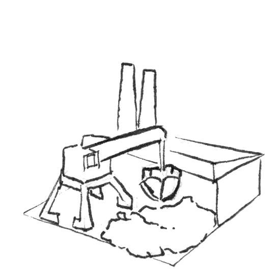
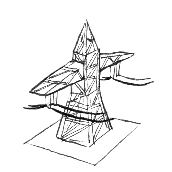
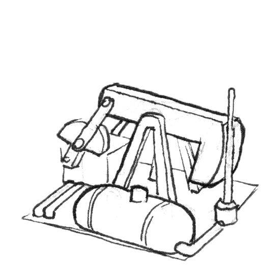
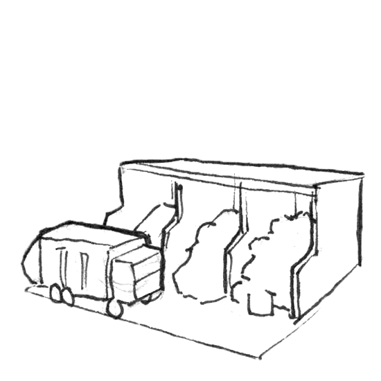
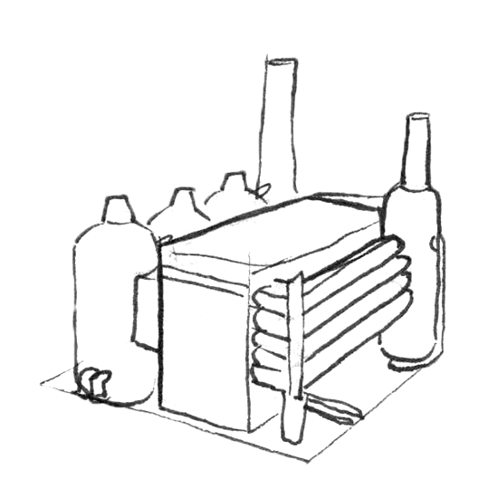
In the sketches tried using a simple shape language to help differentiate the buildings. For example, most (conventional) plants have a generator housing, a energy source and chimneys. Buildings of type Other buildings have cubes as basic shape.
They can be grouped into five categories:
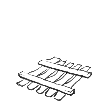
- Resources
- Logistics
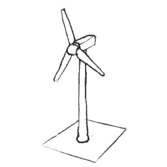
- Power Plants
- Infrastructure
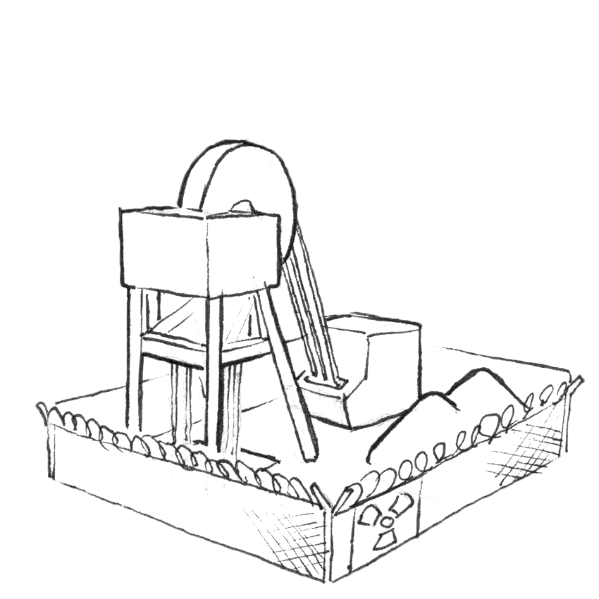
3D Models
The sketches were also the guidelines for the 3d-models. An isometric look is common for building-simulation games. For prototyping, only a subset of buildings was created as sprite.
Implementation
In total, three prototypes were created to test the functionality of the UI.
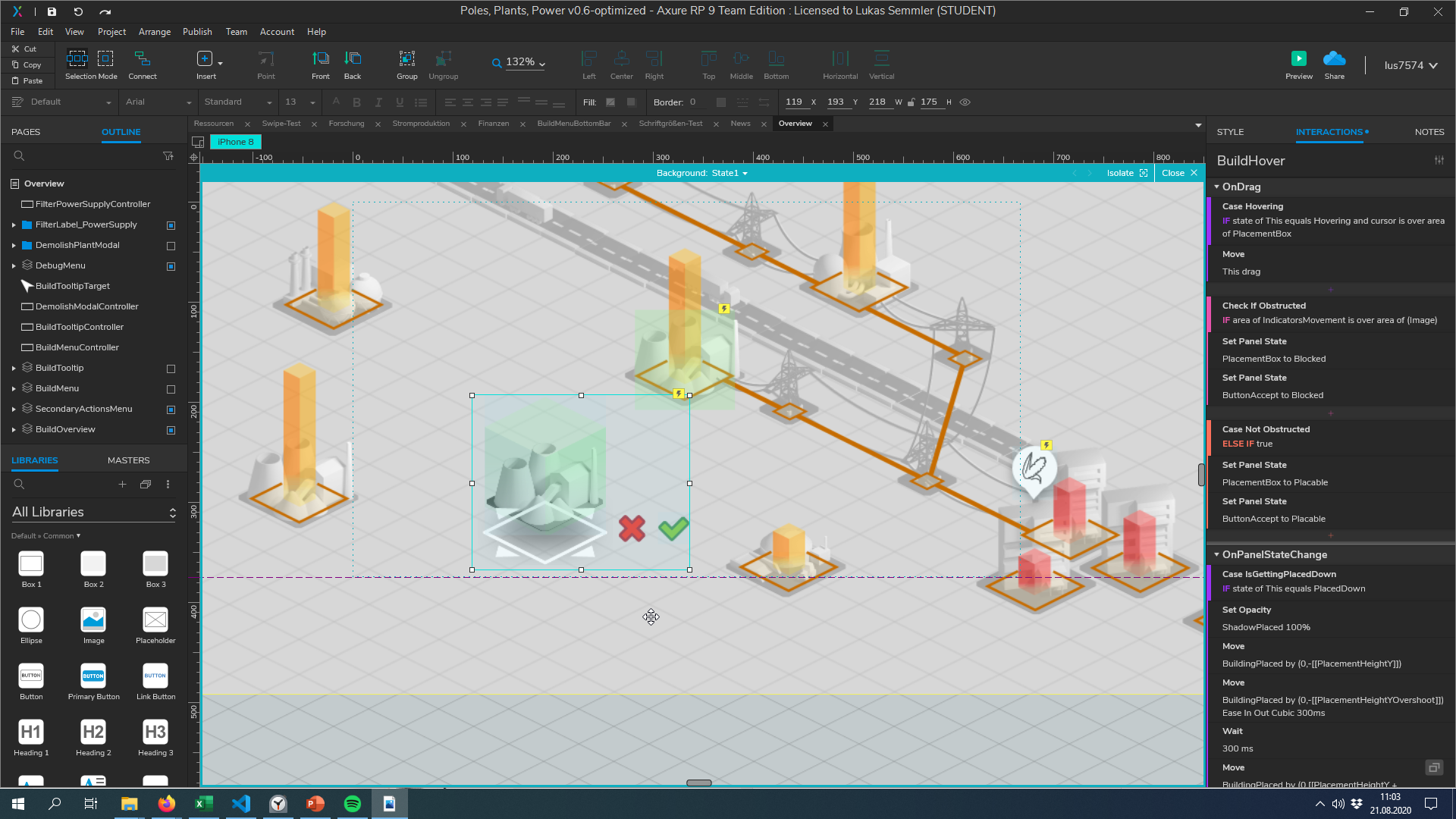
Prototype Axure
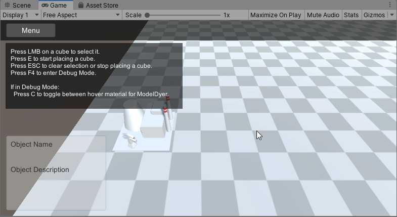
Axure is a tool for creating interactive prototypes and specifications. The software was chosen for the first prototype, because it's focus lies solely on UI design. On the one hand, it turned out pretty useful to create a prototype (visual representation) in conjunction with developing the concept.
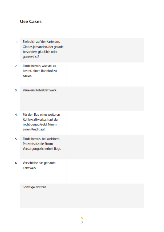
But using Axure also had it's downsides. With the prototype, seven use-cases were implemented, like placing down a building. For this, collision detection is needed: The player should not be able to place down a building on top of each other. So the logic for this had to be worked around.
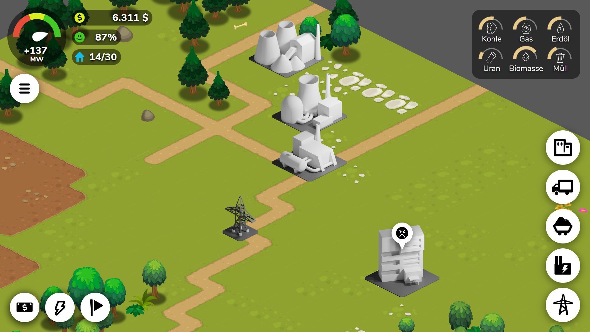
Prototype Unity
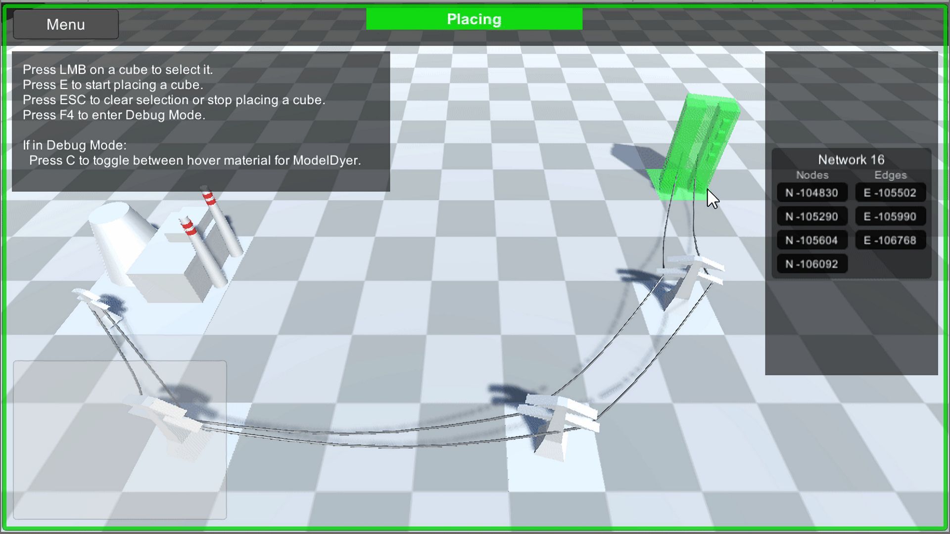
After testing the concept with the click prototype, many shortcomings were obvious: Much of the underlying logic had to be emulated and the prototyping software itself reached it's limits. So as a follow-up, I wanted to make the second prototype with the game engine Unity.
Unity is very powerful, supports multi-platforms and has a rich asset store eco-system. The only drawback is, that the UI-System (UnityUI) is not easily usable. It is based on GameObjects and individual components, rather than markup like HTML & CSS. So I looked for a plugin that could help me and went with XmlLayout.
I also tried putting in some basic gameplay logic. A graph was implemented to accurately handle the electric grid and collision detection was added. But in the end, a prototype with complete core functionality proved too ambitious. Also the UI system still was a hassle to deal with, even with the plugin.
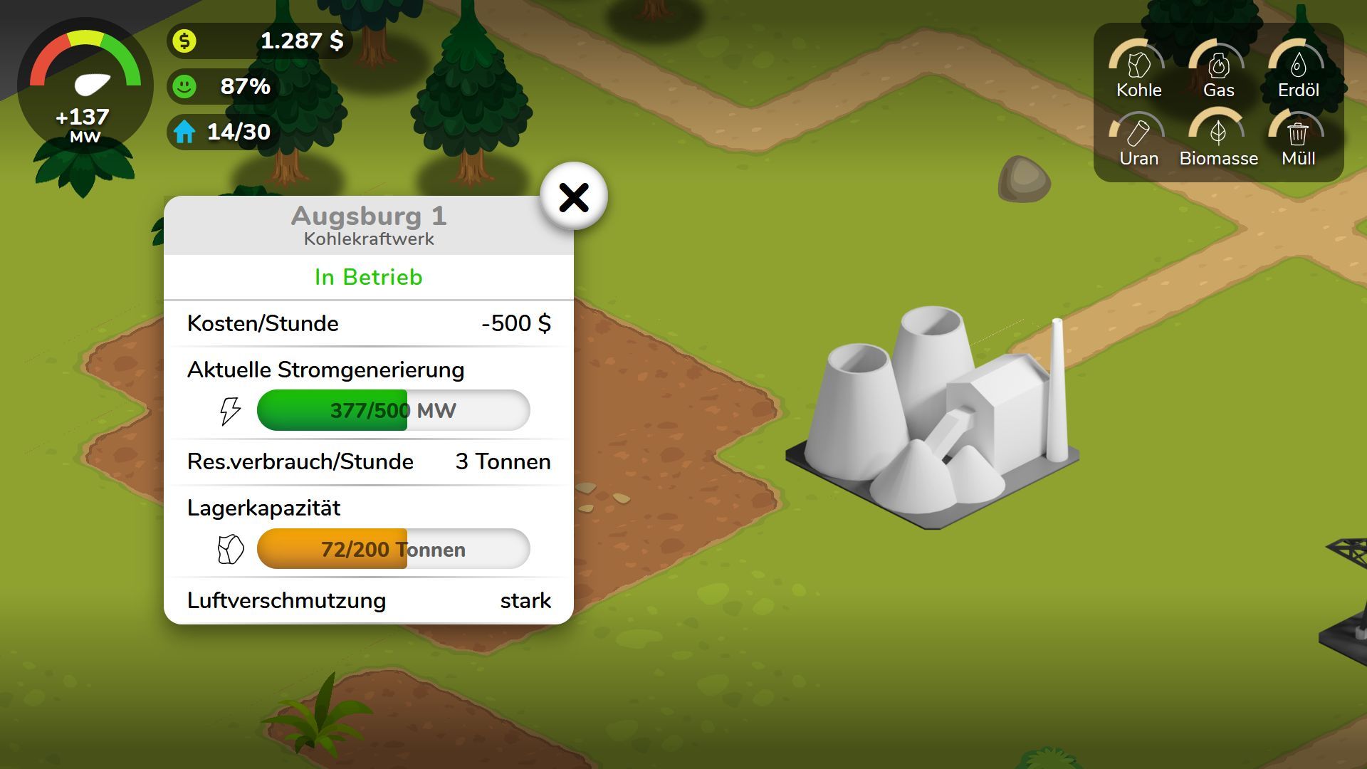
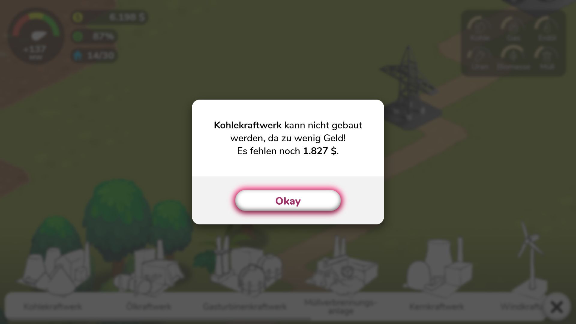
Prototype Phaser & VueJS
Working with Unity made it clear: The most important feature for the prototype is the UI system. So switched technology again, this time to HTML & CSS.
For the game itself, I used Phaser, an HTML5-based game framework. But the UI option in Phaser are very limited. So I set up the UI on top of the game with VueJS. Because both frameworks are based on JavaScript, it was very easy to link both systems together.
With this new system, I went ahead and implemented the basic game logic, like camera movement, map rendering and collision detection. The UI itself communicates with the phaser game via events. E. g. when the player drags a building from the build menu into the game world, the Phaser instance takes over control.
The purpose of the second prototype was to refine the first one and make it visually more appealing. Using the web-based styling options turned out to work great! However implementing the game logic in Phaser was a challenge. For example, there is no native support for isometric maps.
User Testing
The game prototype had to be tested, so it actually was playable by gamers. During the project, two user tests were conducted: The first one with the Axure prototype to test the concept. And a second one to refine said concept and make the game more enjoyable.
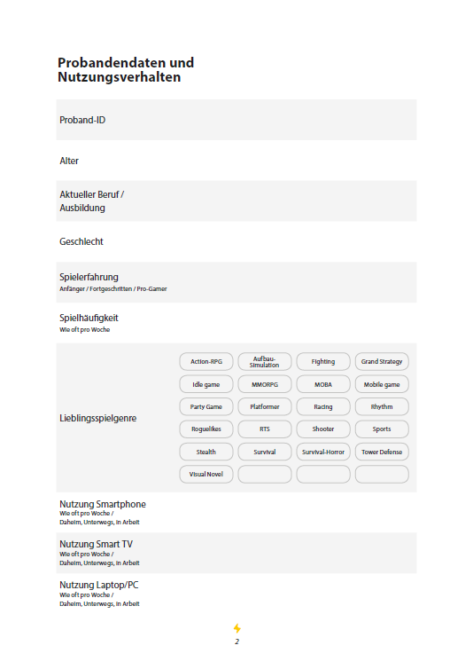
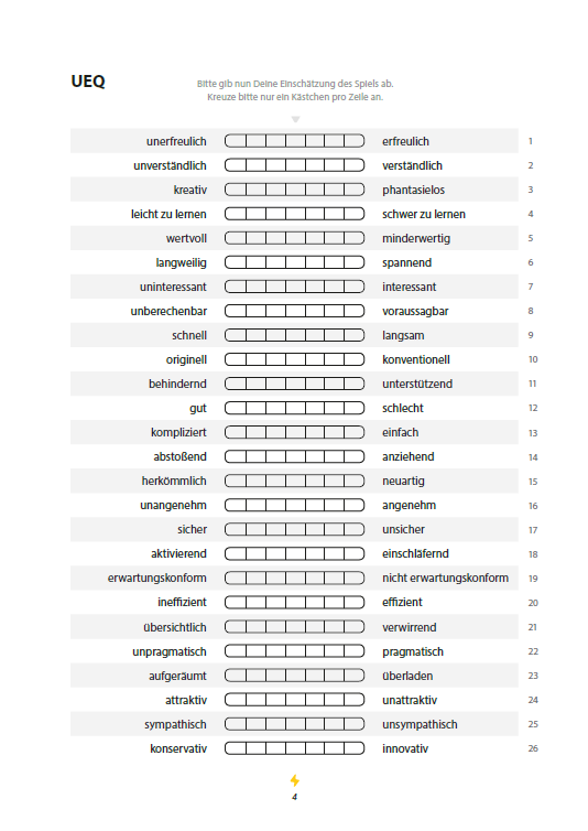
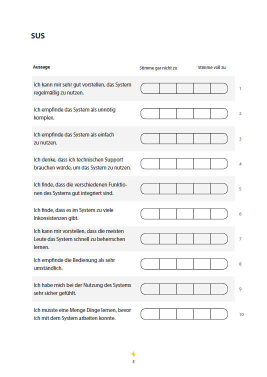
In total, 19 participants were tested. During each test, a participant had to answer questions like their gaming familiarity. After that, 7 use-cases were played in the prototype. To be able to compare said tests, a UEQ and SUS questionnaire was used at last.
Overall, the second prototype received good ratings (SUS score of 72; UEQ between 1 and 2 in most categories). People liked the graphics and usability but some were missing more content for the game.
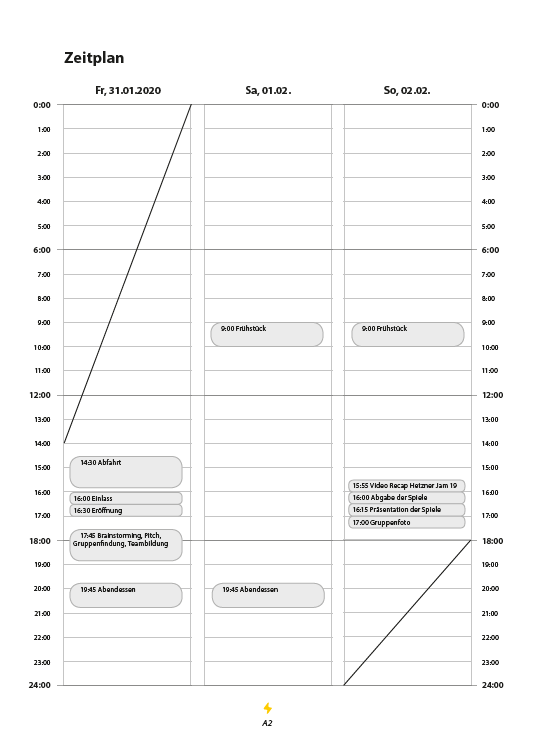
The second user test also was conducted during the Global Game Jam 2020 in Ansbach. It was a lot of fun, especially if you can test your game prototype with highly motivated gamers.

Conclusion
In the end, many different disciplines were involved in making this project. Games are a very interesting medium, because they combine programming and art to make something fun and meaningful. Their purpose is the Game UX they provide and I hope I could learn something about making game UIs in the process.
If you are interested in my thesis, please take a look inside: