Data Visualization
Overview
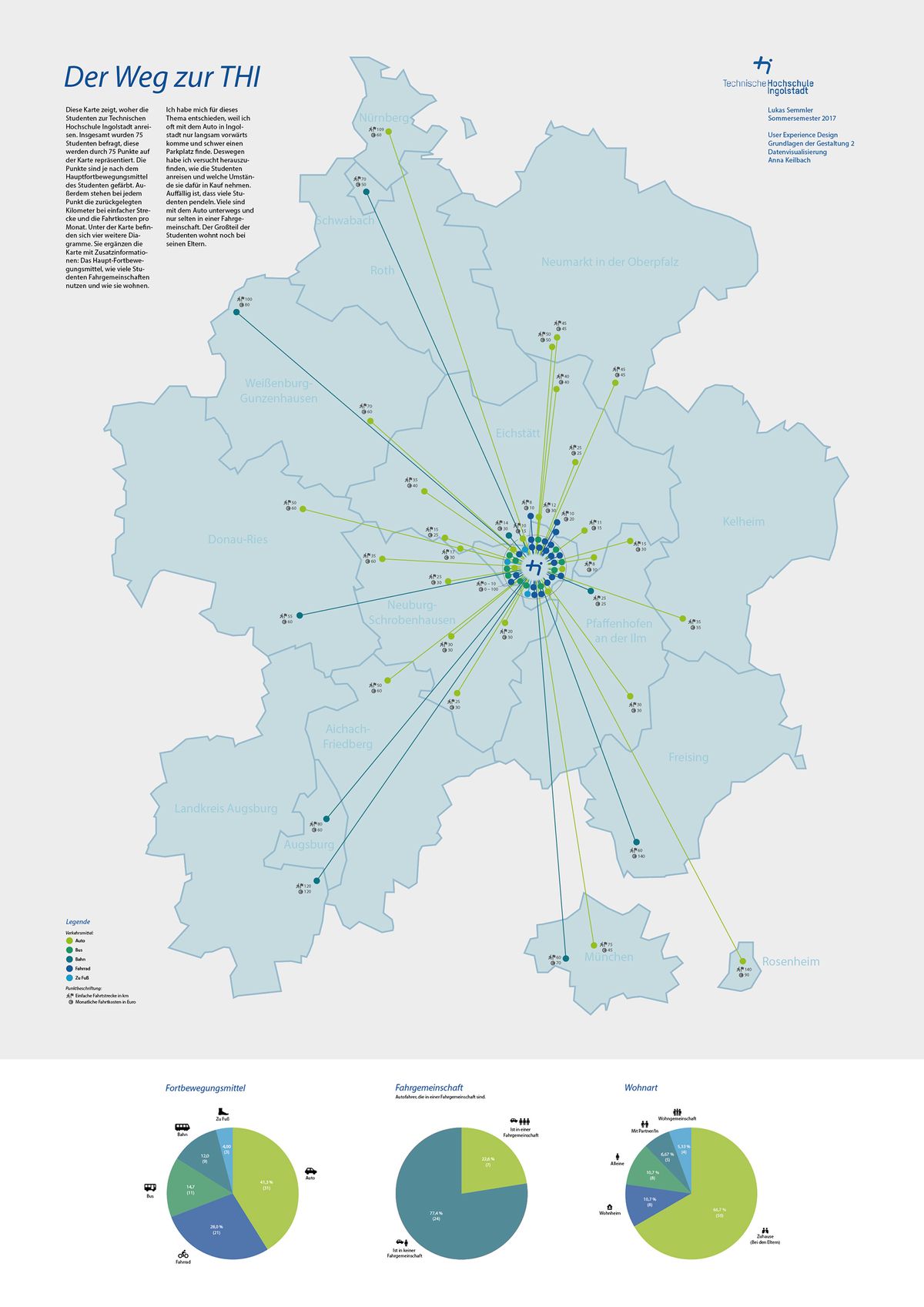
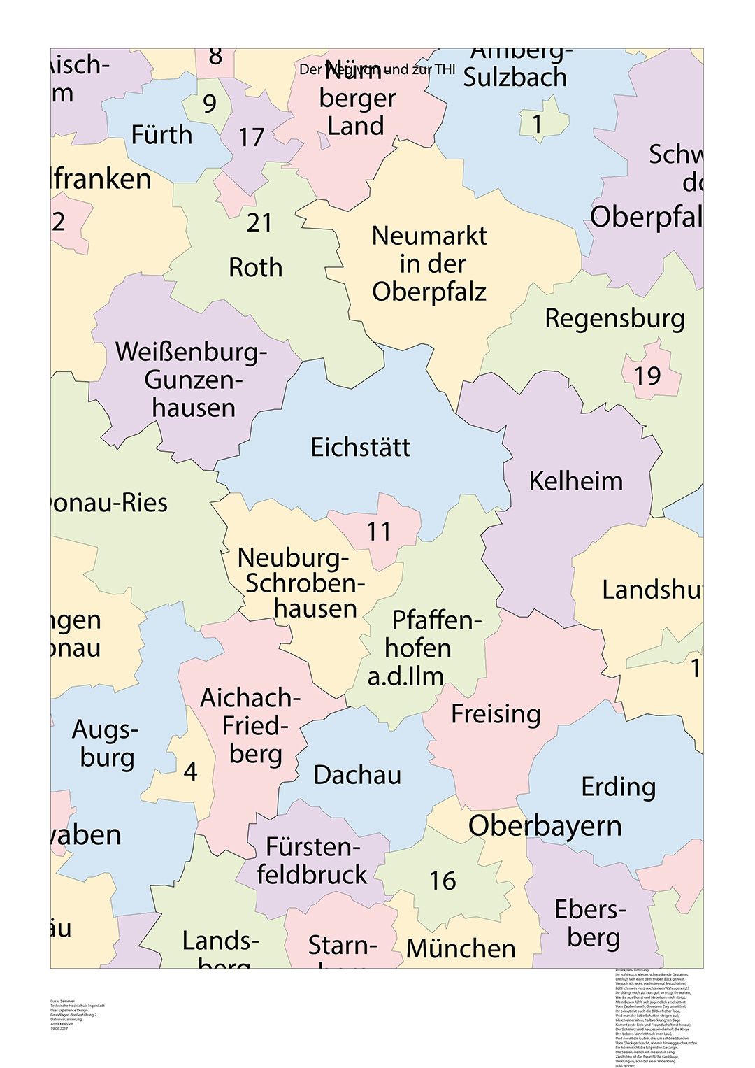
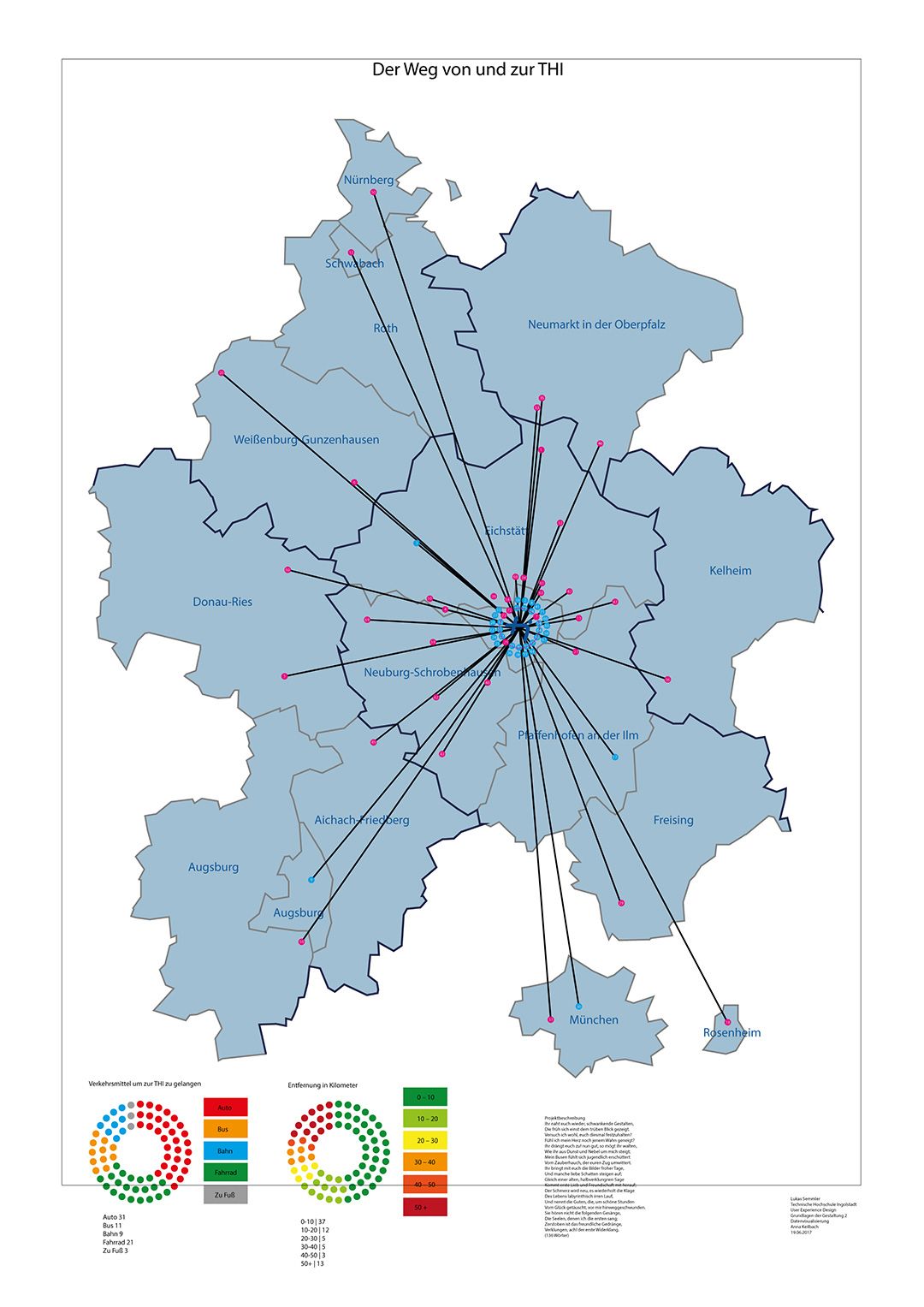
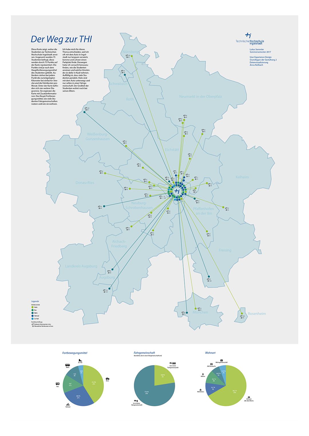
The poster shows, how students get to the Technische Hochschule Ingolstadt (University of Applied Sciences Ingolstadt). It also shows the differences of how they get there. For that, we conducted a survey as a group of three. Afterwards each indiviual person designed a poster. <br>I decided upon making a poster that shows, how students get to the THI. At that time, I was regularly driving to the THI by car and I was interested to see, how over students get there.
Data collection and evaluation
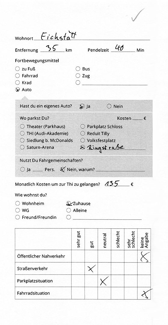
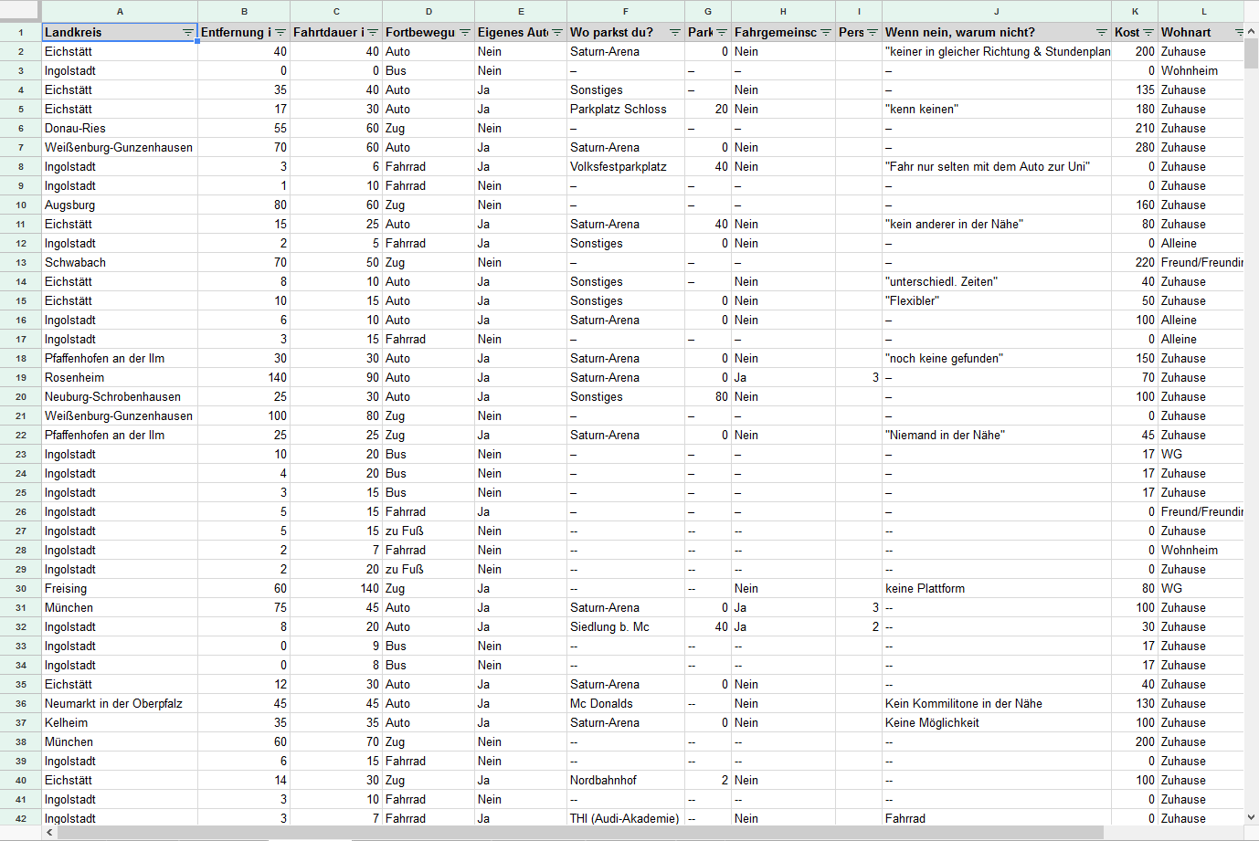
My two colleagues and I surveyed 75 students in total for the data collection. For this, we wrote a survey with questions all about means of transport.
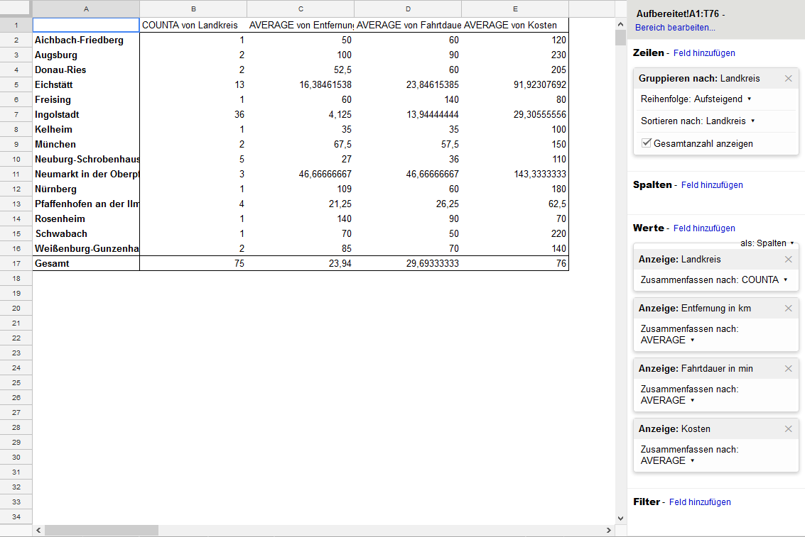
After collecting the data, I went ahead and analyzed it. To find a correlation between different data sets, a pivot table was used.
Concept
After analyzing the data, I came up with different concepts to present the data in an easy-to-understand and pleasing way.
Implementation
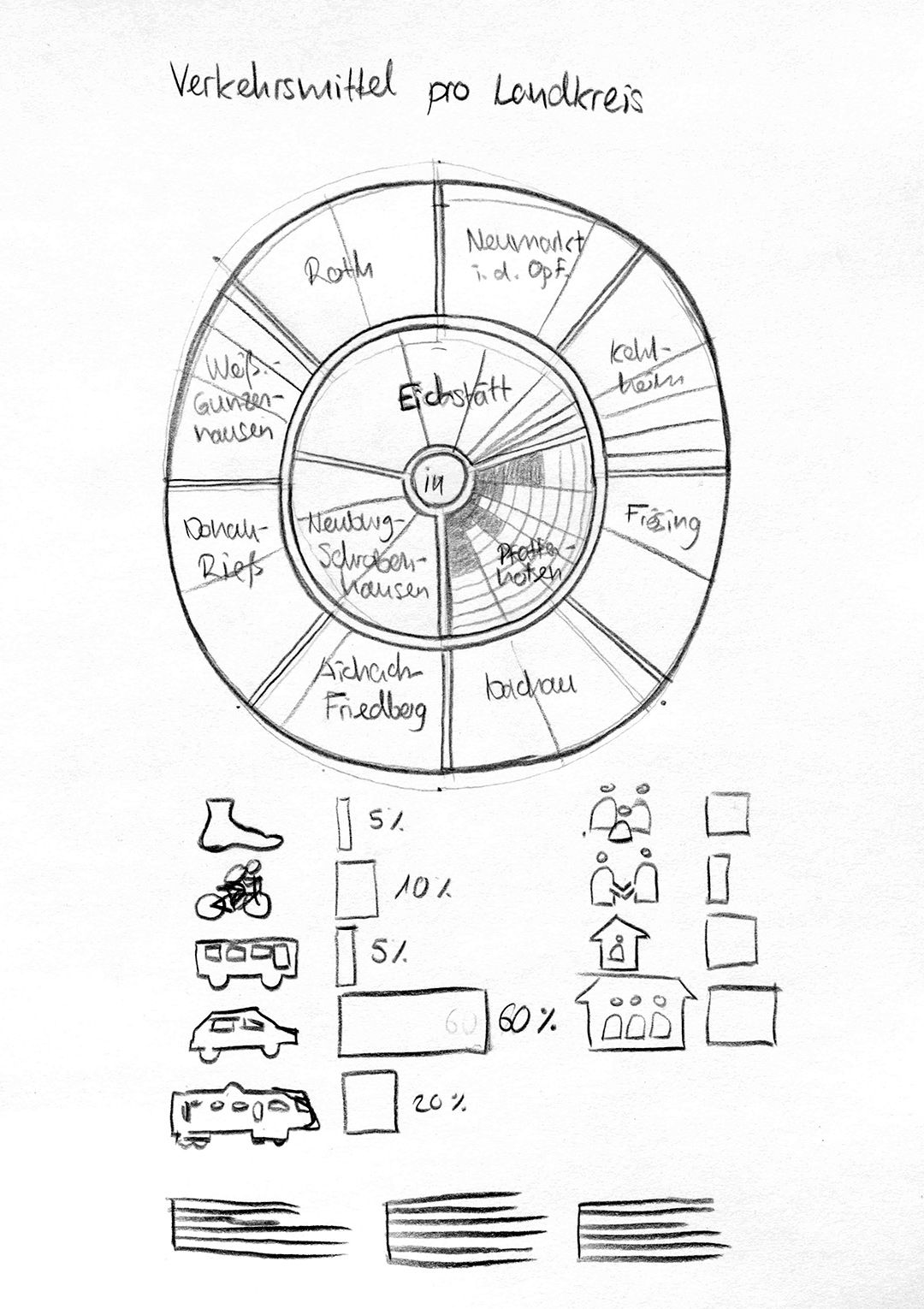
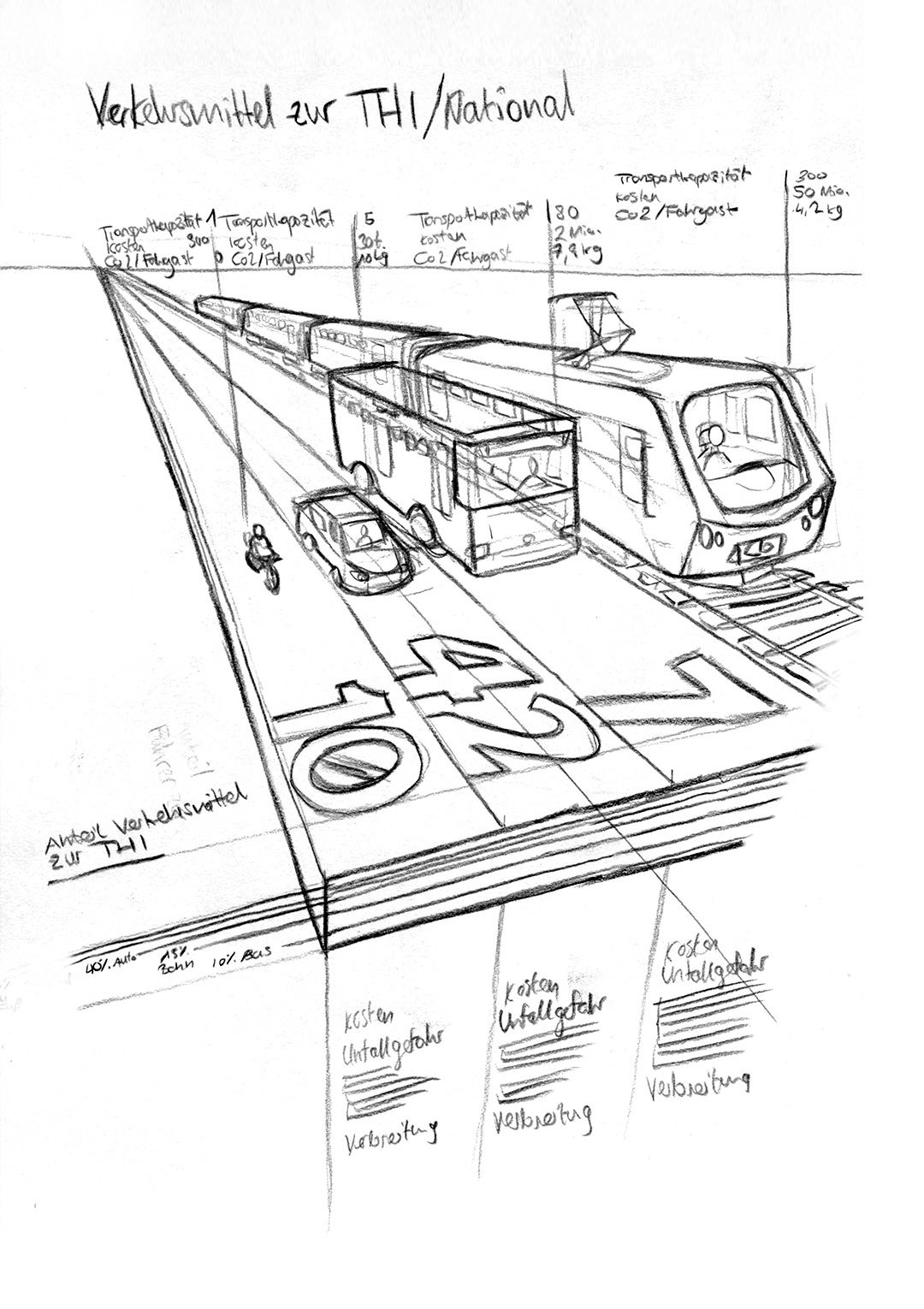
In the end, I settled on the map concept. To spice things up, three pie charts are at the bottom, detailing how students get to the THI.
Icon design
During the design of the poster, I also created several icons. Designing them was the best part of the project!
Design process
step 1
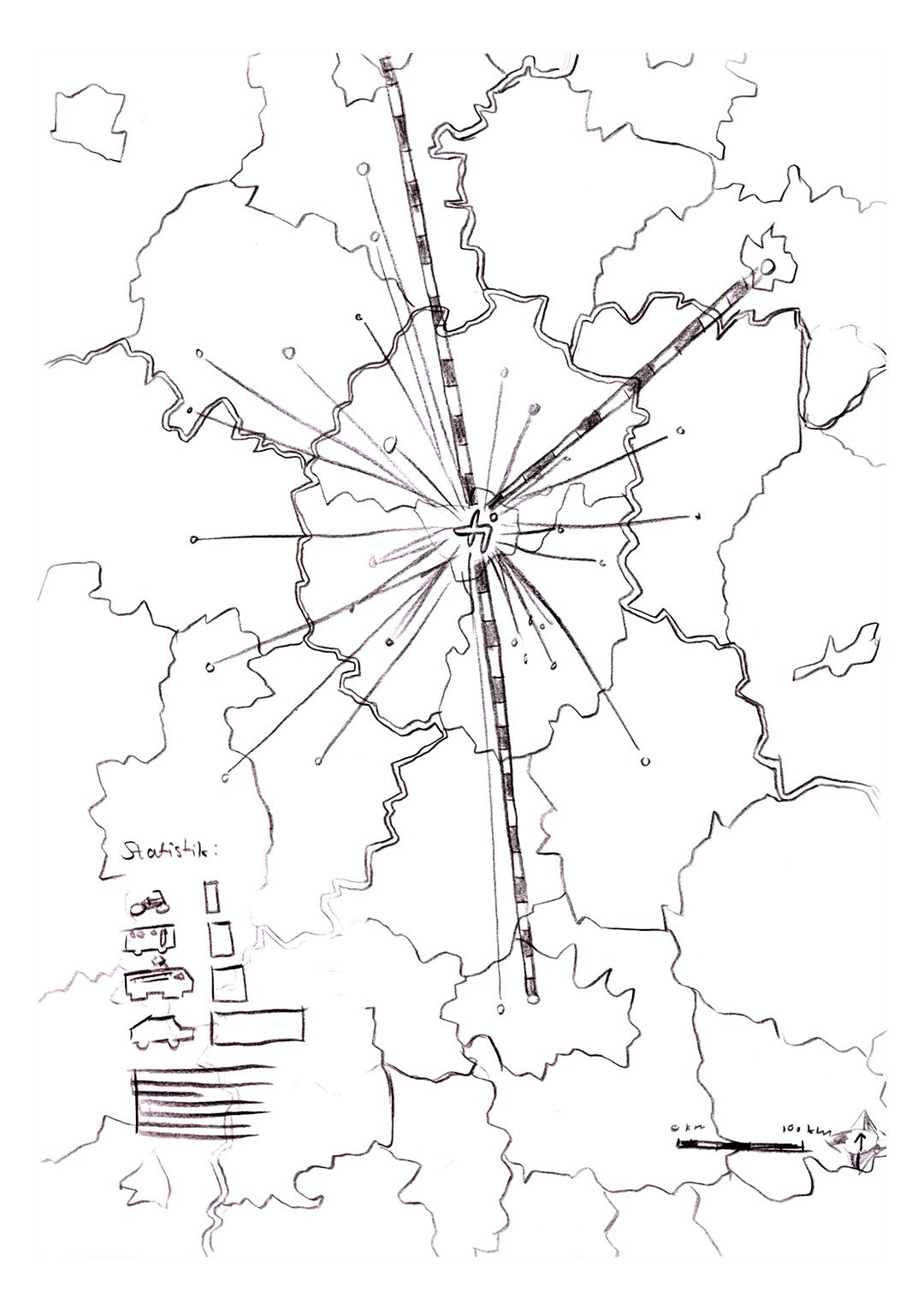
The page format of DIN A1 has been chosen. Also a map of the Bavarian counties is included as starting point.
step 2
The singular positions are connected with the THI logo. In the bottom left, you can see the distribution of means of traffic. Each point is a data unit.
step 3
The layout, colors and the distance between the points gets adjusted. There are also now icons included with the pie charts.